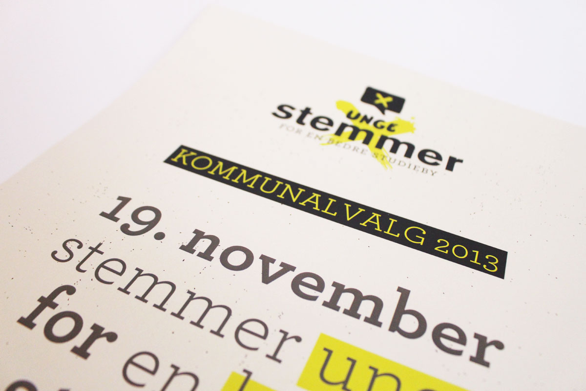
Making a visual identity for DSF - in a campaign to get more young people to vote, I started out very lo-fi with some ink and a brush, to make the right X, and the right ink splatter.
The X would then form the background of the logo, which was glued together with a "young" yet serious choice of type (Helvetica + handwritten + Archer) using colour and ink splatters as a general branding element.

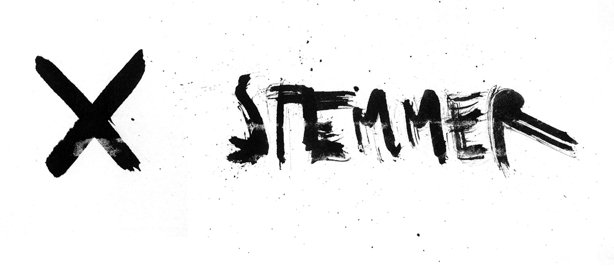
Playing with ink effects.
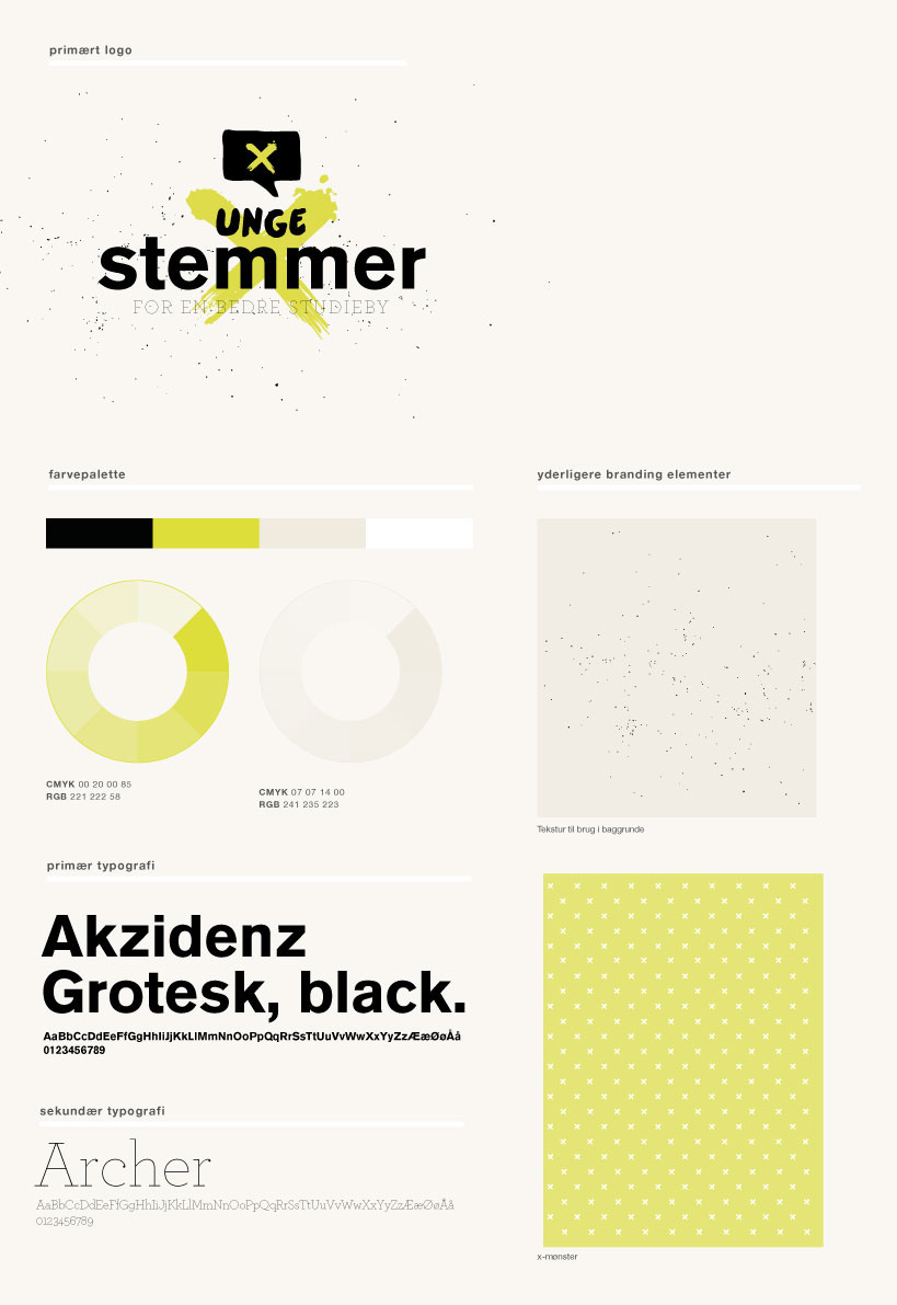
Branding chart for the client - including different backgrounds and uses of the colors, the X and the typography.

The look versioned for web.

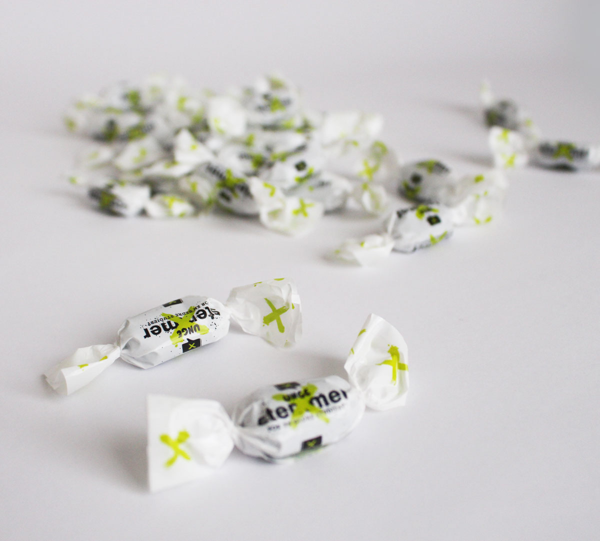
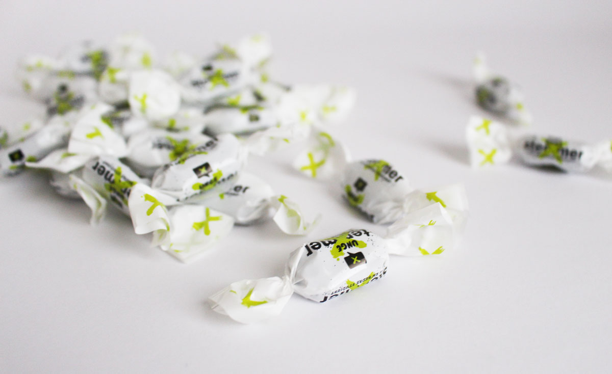
There was lots of merchandice in this project, and the green X served well as a signifyer.
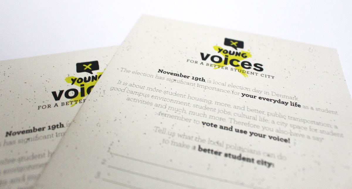
The look versioned for flyers.
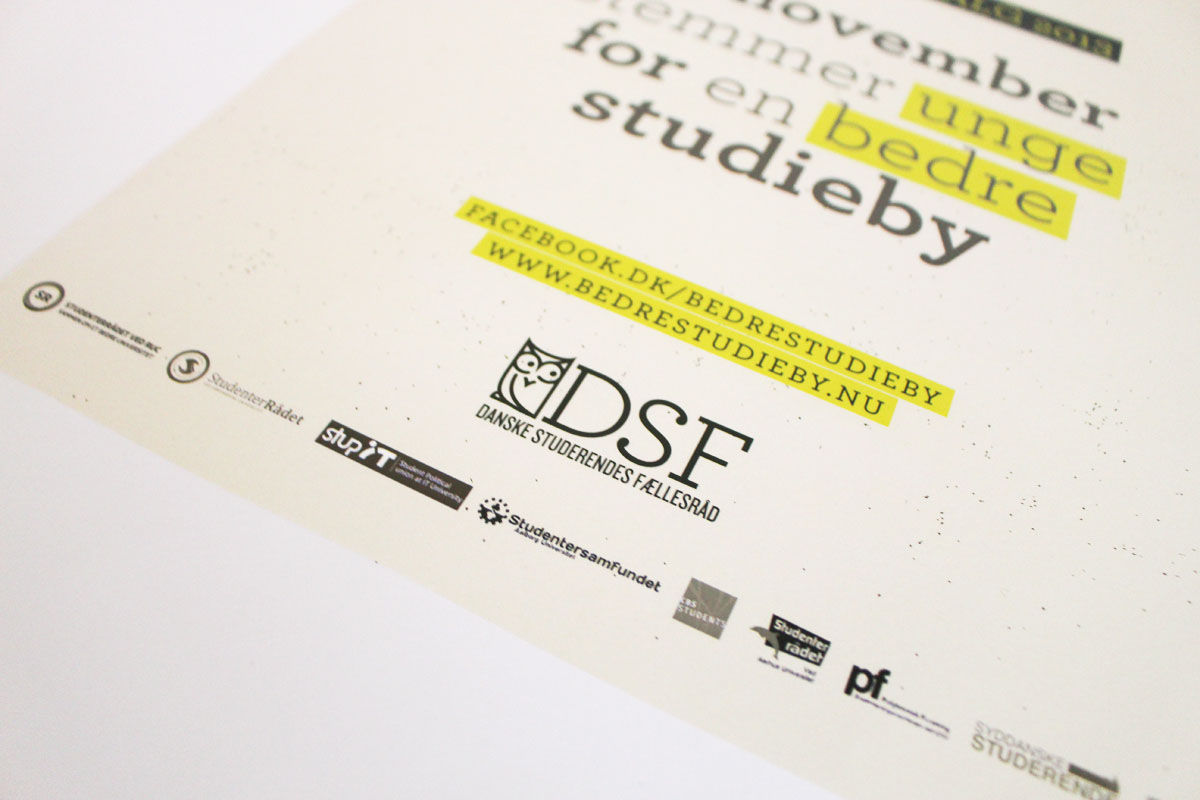
A3 posters.