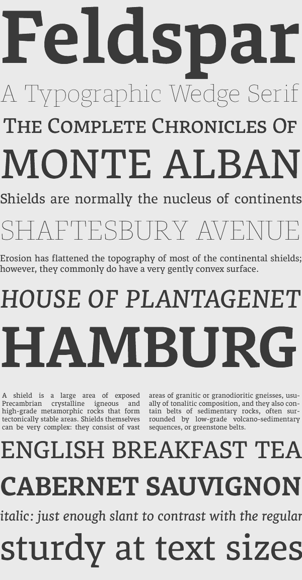
Feldspar
A typographic wedge serif for news and editorial.
A typographic wedge serif for news and editorial.
A chunky, textured typeface designed for immersive reading, Feldspar sits between calligraphic and typographic styles. Large, open counters, dark extenders and medium contrast ensure good readability.
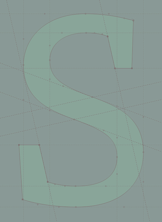
Felsdpar's squarish forms, strong unbracketed serifs and ink traps allow it to be used at news and editorial sizes (ideally 9pt) without clogging. The angle of stress is rhythmically varied between glyphs, allowing each letter to take on its own personality, reducing visual stutter.
Feldspar's italics have a subtle slope (about 1:9), so I wanted to find other ways to distinguish it from the roman. In contrast to normal italics, the entry and exit strokes have not been made more fluid and pronounced, as this lends a softer, more cursive feel, which would have looked fussy and impractical given the uncompromising sturdiness of the roman. Those entry and exit strokes have become serifs and semiserifs instead. To hold the face back from looking too angular and mechanical, however, I've introduced curves in places that suggest forward motion, giving the italic a faster, more dynamic feel.
The bold weight was designed to add emphasis to passages set in regular, yet it is not so bold that it cannot also be used in its own right for applications such as titling or short runs of text that require extra definition.