

A focus on the integration of typography, imagery and information at a large scale. I chose to research Philippe Apeloig–French designer and typographer. In my process, I worked with nature and everyday objects based on a system that was loosely inspired by his style. The typographic experimentation presented his name by highlighting certain parts of the letters and dimming the remaining parts.
There are two posters (and a "system" layout) for this series. 25'' x 34''
'
Advised by Lucinda Hitchcock for Typography II Class in Spring 2013, Rhode Island School of Design.
The "system"
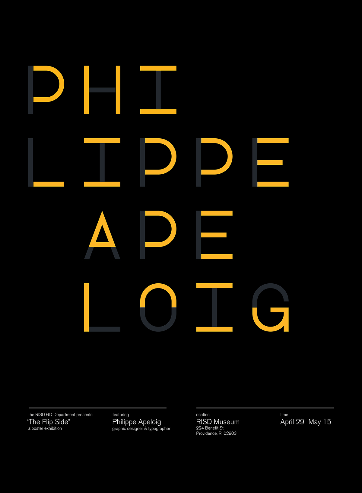
The first poster is for an exhibition. Parts of the letters are debossed and the remaining parts are scored.

The second poster is for a lecture. I still kept the same concept while using flowers instead.


