


Client: Queen Hair SA
Services: Branding & Logo Design. Graphic Design. Photography
It’s always refreshing to collaborate with companies that are not afraid to engage big ideas and venture into uncharted spaces. One such company is the visionary haircare start-up Queen Hair SA. While hard at work finalising their product offering and about to host the very first natural hair event in Nelson Mandela Bay history, they got in touch with me to help them realise their logo.


Project Queen, a South African haircare startup, needed to establish a single, unified brand identity with a single purpose, speaking to all who engage with them in one voice. They needed a visual identity that will grow along with them, going beyond haircare information & products and into a broader influencer role.
My task was to serve as the campaign’s art director, overseeing the creation of all visual elements, as well as any other required marketing assets.

As somewhat of a pioneer within their space, Project Queen’s corporate branding needed to carry a polished and refined aesthetic. The resulting solution was an expression of the strategy statement: “Love your crowning glory”. This was presented through incorporating elements of; (1) royalty - via the gold material and the crown, and (2) a theme of love & embrace - visualised through the circular framing of the logo.


Development
My visual development process always starts with a research phase, which includes creating moodboards for inspiration and is accompanied by early sketching. This helps promote the exploration of multiple directions as early as possible.


After a few rounds of research and moodboarding, a clear visual concept began to appear, one that perfectly captured the intricacies of the phrase “Love your crowning glory”.


Production
After the client had given their input, approving of the concept and giving the go ahead, I turned to my core tools from the Adobe Creative Suite - namely Illustrator and Photoshop - and began to build the logo, aligning it’s proportions and rendering it into it’s final, print ready, golden glory.

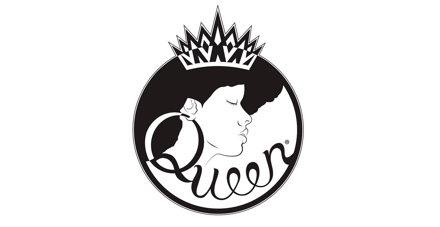

There’s a famous saying that “colour is the silent ambassador for a brand” - this couldn’t be more true. Given it’s importance in carrying the overall mood, no mistakes could be afforded in the colour and material selection. In choosing a gold material for the logo, the theme of your hair being a symbol of royality, of something to be honored, was easily communicated.
The primary typography was selected to be clean and legible as to not distract from the logo.


Creating all these different brand assets, such as the logo, the colour schemes and the typefaces, is rather worthless if you cannot also create a capable design system that will weave these disparate elements together in the service of a larger brand related goal. Project Queen’s branded messaging features a lot of vibrant images that accompany poetic words. Showing how all these can be cohesively presented was important.


With all the pre-event work done it was time to call curtains on this leg of my collaboration with Project Queen, but not before I got behind the lens for another role, this time as the behind-the-scenes photographer for their first event.


