


Av Street Food packaging
Objective To redesign the package for the street food products of the brand "Already Ready-To-Eat" of Azbuka Vkusa. The main target audience consists of young people, active persons who are used to eat on the move.
Troubles The main problem with current design for our street food products is that it does not respond to the needs of the target audience. It is difficult to navigate the widest assortment range, there is a lot of visual noise on the package, the product features are incomprehensible, and the product itself is not particularly visible inside. There is also one more problem because of the company's point of view concerning the display of the products on the shelves. In the current design option, we must use as many as two photos for each product and also write many "beautifying" selling words to put the product on the shelf.
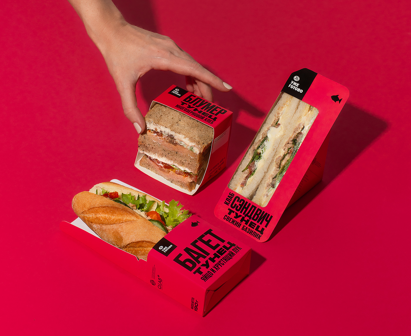
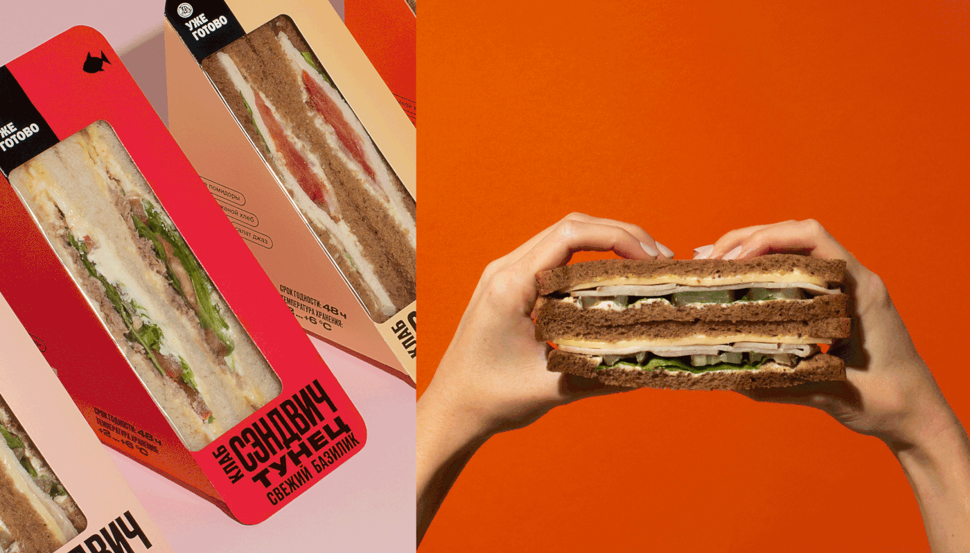
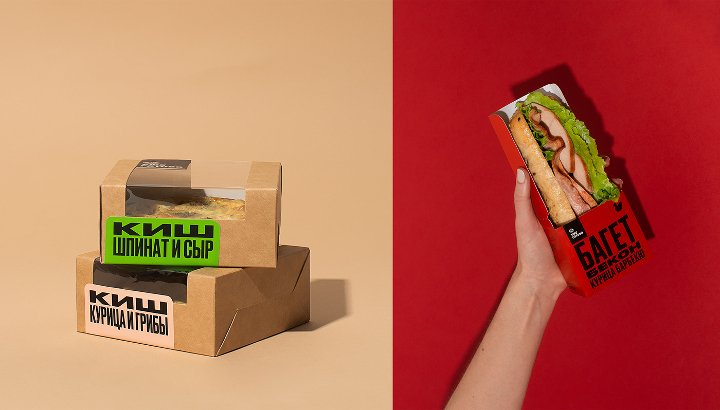
Solution The redesign has been approached comprehensively. We have reviewed all the cuts in all existing packaging types and have improved a lot of things. We have made the products visible to the maximum extent possible, and now, the product can sell itself. We have developed a vivid and coherent system: no texts with inviting effects and complex labels, and which is most importantly, we have got rid of the photos, because the product itself is great. The design system is now based on a large, dynamic typography which attracts attention and tells the consumer what the product looks like and what ingredients it is made from. Simple and plausible. Minimalistic icons and colours are mirroring the main ingredient of the product, which creates clear coding for the consumer. We have put features and important unique selling propositions on a package side and tagged them to make it easy for consumers to find the characteristics that are important to them. In the new design, the product info can be read easier from afar and looks cleaner in a single merchandise display unit.
Задача Сделать редизайн упаковки для ассортимента стритфуд для бренда «Уже готово» Азбуки вкуса. Основная целевая аудитория — молодёжь, активные люди которые привыкли есть на бегу.
Проблемы Основная проблема текущего дизайна для ассортимента стридфуд — она не отвечает потребности целевой аудитории. Сложно ориентироваться в огромной ассортиментной линейке, много визуального шума на упаковке, непрозрачные характеристики продукта, да и сам продукт не особо видно. Существует проблема и при выпуске продукта на полки с точки зрения компании. В текущем дизайне нужно использовать целых две фотографии для одного продукта, а также написать много «красивых» продающих слов для того, чтобы продукт поставить на полку.
Решение К редизайну подошли комплексно. Пересмотрели все крои во всех существующих упаковках, и многое в них улучшили. Сделали так, чтобы продукт в них был виден максимально, продукт продает сам себя. Разработали яркую и понятную систему: никаких «завлекающих» текстов и сложных клеймов, а главное — избавились от фотографий, ведь продукт сам по себе классный. Теперь в основе системы дизайна лежит крупная динамичная типографика, которая привлекает внимание и рассказывает потребителю, что это за продукт, и из каких ингредиентов он сделан. Просто и понятно. Минималистичные иконки, цвет отображают главный ингредиент продукта, что создает понятное кодирование для потребителя. Особенности и важные УТП мы вынесли на боковую сторону и выделили их тегами, чтобы потребителю было легко найти важные для него характеристики.
В новом дизайне продукт легче считается издалека и чище выглядит в едином блоке выкладки.
В новом дизайне продукт легче считается издалека и чище выглядит в едином блоке выкладки.
Design director Arnis Millers
Art director Alexandra Loginevskaya
Design & layout Alexandra Loginevskaya,
Illustrations Valeria Ponamorenko
Photography Elena Boduen
Text Maria Bushueva, Ira Ivanova
Project management Alena Radionova,
Kristina Putinceva, Anastasia Safonova


