I was commissioned to redesign the existing labels of Orbelia wine brand a few years ago. I really liked how they looked because the label was very clean and somehow elegant. Unfortunately they did not have the necessary appealing look when placed on the shelf among other wines and in some aspects they even suffered from kind of ‘visual weakness’.
Considering also the fact that there were almost no embellishment on the labels the need for a change was crucial.
Considering also the fact that there were almost no embellishment on the labels the need for a change was crucial.

Orbelia Wine Brand redesign ‘Step 1’ started with a bottle change.
We decided to replace the classic bordeaux-style bottles with elegant burgundy-style ones. This was very significant change as the the new bottle silhouette was very different.
I like the bottom part of the new bottle as it gives enough space to create larger label. And this is exactly what I did – a wide, almost wrapping side-to-side label and here is the beginning of the new story.
Orbelia is actually name of a mountain in South-West end of Bulgaria. The mountain gave me the inspiration to design more unusual label shape for Orbelia wine brand. I connected 3 triangles at the top of the label in order to create visual idea of a mountain. Then I decided to make it more abstract and instead of drawing a mountain with slopes, hills etc., I decided to use original Bulgarian embroidery pattern instead. As a result we had very wide wine label with unusual mountain on top made of embroidery pattern in different colors, mixed with hot foil stamped elements.

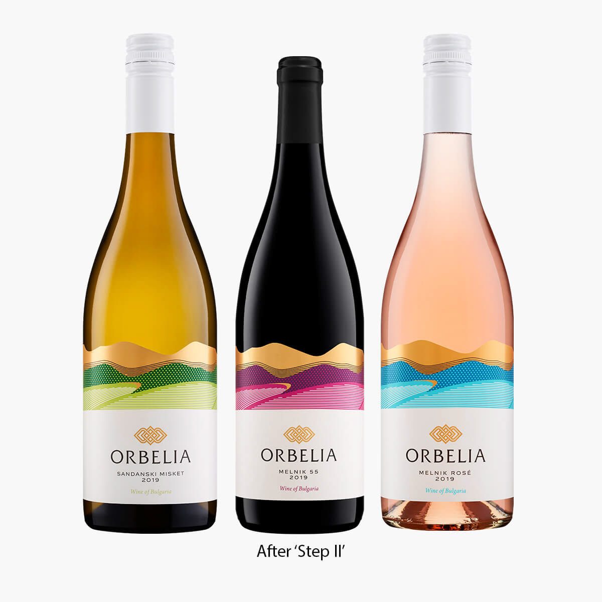
‘Step 2’ of Orbelia Wine Brand redesign started in late 2019.
Together with Orbelia team we decided that the time of Mk. I redesign is over and we had to do a more significant change in order to make the label even more fresh, attractive and recognizable.
Keeping the mountain from Mk. I redesign was something we all wanted but at the same time we were looking for a twist that would make the label look catchy and modern.
I decided to create a vector digital illustration of the mountain and the vineyards of Orbelia Winery at its foot. These types of illustration always bring freshness into design and are very easy to manipulate in color nuances which makes them excellent color spot to make the whole design more recognizable on the shelf. In fact the whole new label is almost white except the mountain drawing which is always using attractive color scheme that shines against the white label background. Another successful effect I used in this Orbelia Wine Brand redesign was adding solid landscape elements stamped with warm gold hot foil at the top of the label making the border between the label and the bottle even more attractive. To make the final touch in this new redesigned wine label I added transparent raised varnish on the mountain and the vineyards so as to get different reflections from the bottle when you rotate it in hand.
I also changed the winery logo – that was in ‘Step 1’ redesign, but I will leave this for another case study.
Psssst – the new logo features same 3 hills like the ‘Step 1’ redesign!
We have very positive feedback from the winery’s marketing department confirming that all these changes worked for getting more compelling new look and make the Orbelia Wine Brand bottles stand out among the other on the shelf.
Credits:
Client: Orbelia Winery
Design: the Labelmaker
Print:
Redesign Mk. I – Rotoprint
Redesign Mk. II – 2M Print
Client: Orbelia Winery
Design: the Labelmaker
Print:
Redesign Mk. I – Rotoprint
Redesign Mk. II – 2M Print


