Visual identity and stationery for the Knoll.
The Knoll is situated along the Erie Canal in New York and is the residence of Jennifer Butler, the author of the extraordinary James Jennifer Georgina.

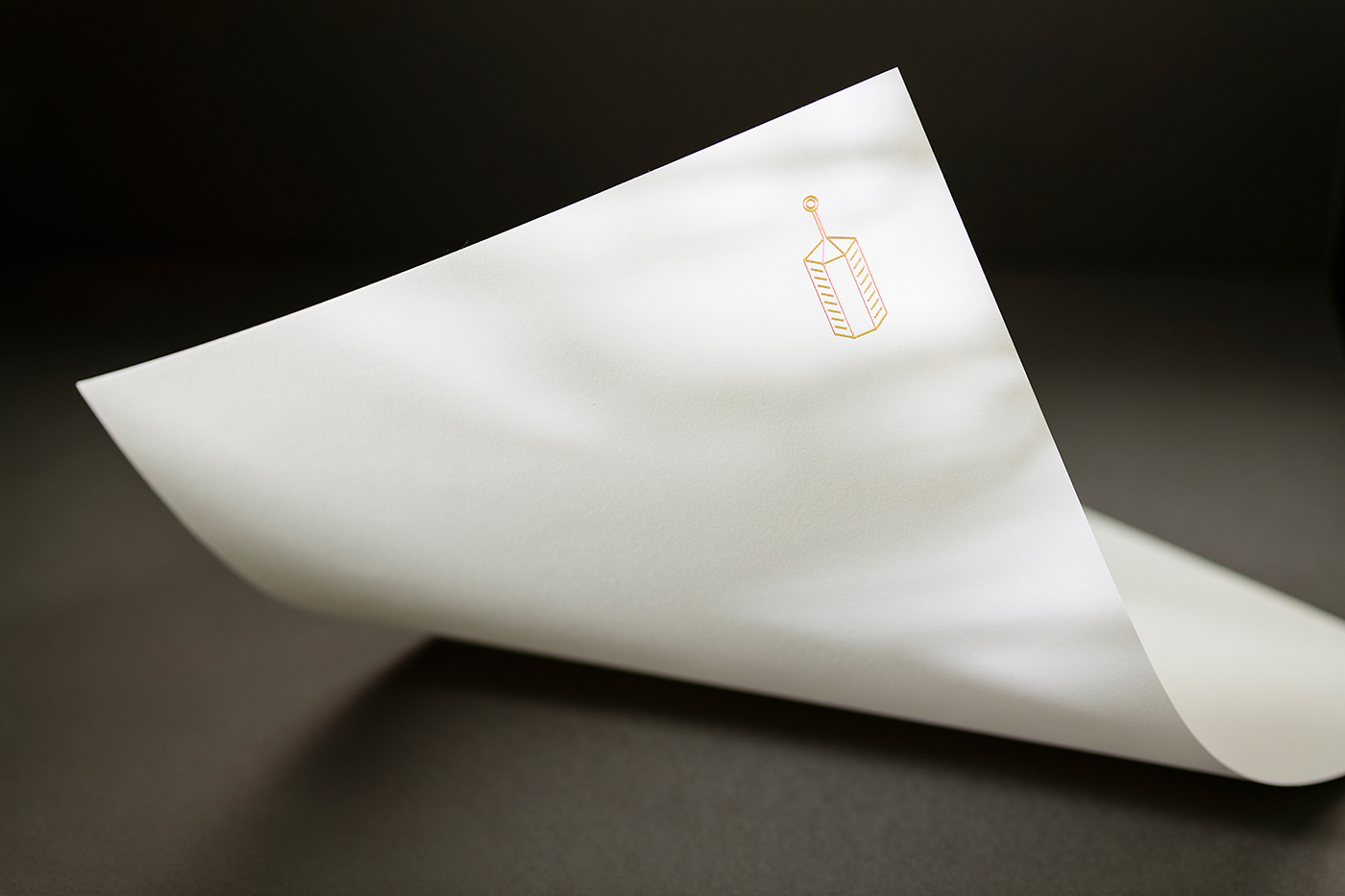
Symbol
The house was previously owned by one of the largest wood importers in the United States, who supplied wood to the great ship-building companies. This explains the elaborate ironwork on the front door featuring a sailing ship with a lantern on its mast. Jennifer’s tarot card, The Hermit, also carries a lantern. The Hermit represents reflection, light, experience, wisdom, introspection and looking for answers within. Thus, the symbol for the house became the lantern.

Paper
Thinking about the paper stationery, we turned to the Mohawk Mill. Paper production is highly dependent on waterways: canals were used to ferry raw materials to paper mills and transport the finished product. One of these mills — Mohawk — was founded in 1931 in upstate New York, where the Hudson and Mohawk rivers come together.
There is a strong connection between the mill and its surrounding waterways, the Hudson and Mohawk rivers and the Erie Canal. By using a paper produced by the mill, we symbolically reunite the mill with the canal once again.

Typography
The type lines meander left and right, like the waterways the house stands on. We chose Mabry by Benjamin Critton & Colophon Foundry. ‘Rendered from the overlaps of grotesque and geometric types, Mabry is a vernacular study in dualities: the type is candid and forthright, but also a bit mischievous at times’.

While researching, it became clear that all of the elements are interconnected: The Knoll was owned by wood importers, who used boats on the canal to sell it. Paper is made by combining water and wood. The wood was used for making boats. The boat on the window has a lantern. The lantern is held by the Hermit, which leads back to the house.
Still life images by Edward Park.
