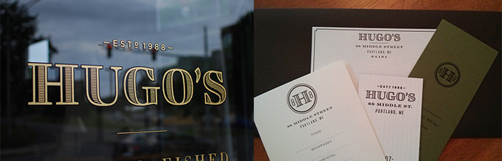
Opened in 1988, Hugo’s has become a fixture in Portland restaurant scene. Over the years, the restaurant has seen a few ownership changes, the most recent being about a year ago. The current owners were looking to overhaul the interior space and identity. Having just worked with Might & Main on the successful branding of their oyster bar, Eventide, Might & Main was asked to work on the redesign for Hugo’s.
The aesthetic for the new Hugo’s identity is inspired by turn-of-the-century Portland. The renovated interior space strikes a balance of being austere while warm and inviting. The new logotype needed to fit into that world. While Might & Main was working on the new identity, they had a sense of the supporting typefaces they wanted to use and the treatment they wanted for the logotype, but they could not find a retail typeface that suit their needs. This is when I started to work on the project to develop a solution. After reviewing a few concepts we settled on final letterforms seen below. The logotype needed to be used at a broad variety of sizes, from the signage on the building to gift certificates. This was further complicated by the fact that the original concept was for the logotype to have an offset stripe treatment to create texture. The first step was to create a low contrast version of the logotype to be used at smaller sizes.
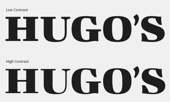
Dealing with the stripe treatment was a little more complicated. Ideally the detail of stripes should never get too fine such that they become difficult to register. After all the potential uses of the logotype were considered, we decided that we needed five versions with the smallest not using the stripes. The challenge of the determining the stripe sizes lies in the fact that the interior space of the “H” and “U” are smaller than the “G,” “O” and “S”. Rather than relying on trial and error to determine the stripe widths, I calculated where the periods of the stripes for the two groups of letterforms would converge to get a rough size, then tweaked from there. Once the stripes were drawn for all four versions of the logotype they were optically corrected to make them all appear to have a similar weight. The shorter stripes that go around the curves were made to be heavier to compensate for their loss of mass. Likewise, the long stripes through the spine of the “S” were thinned.


