
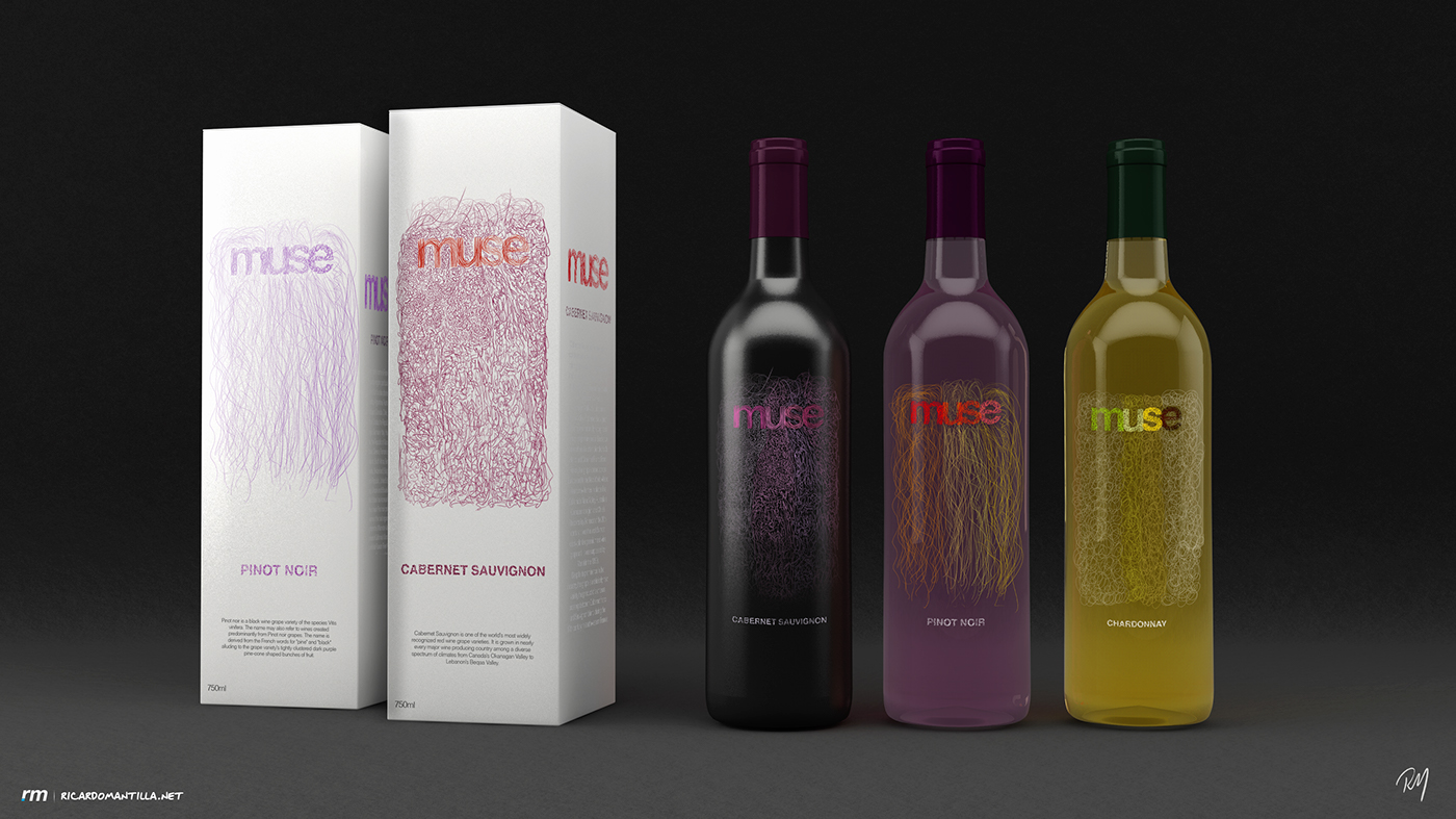
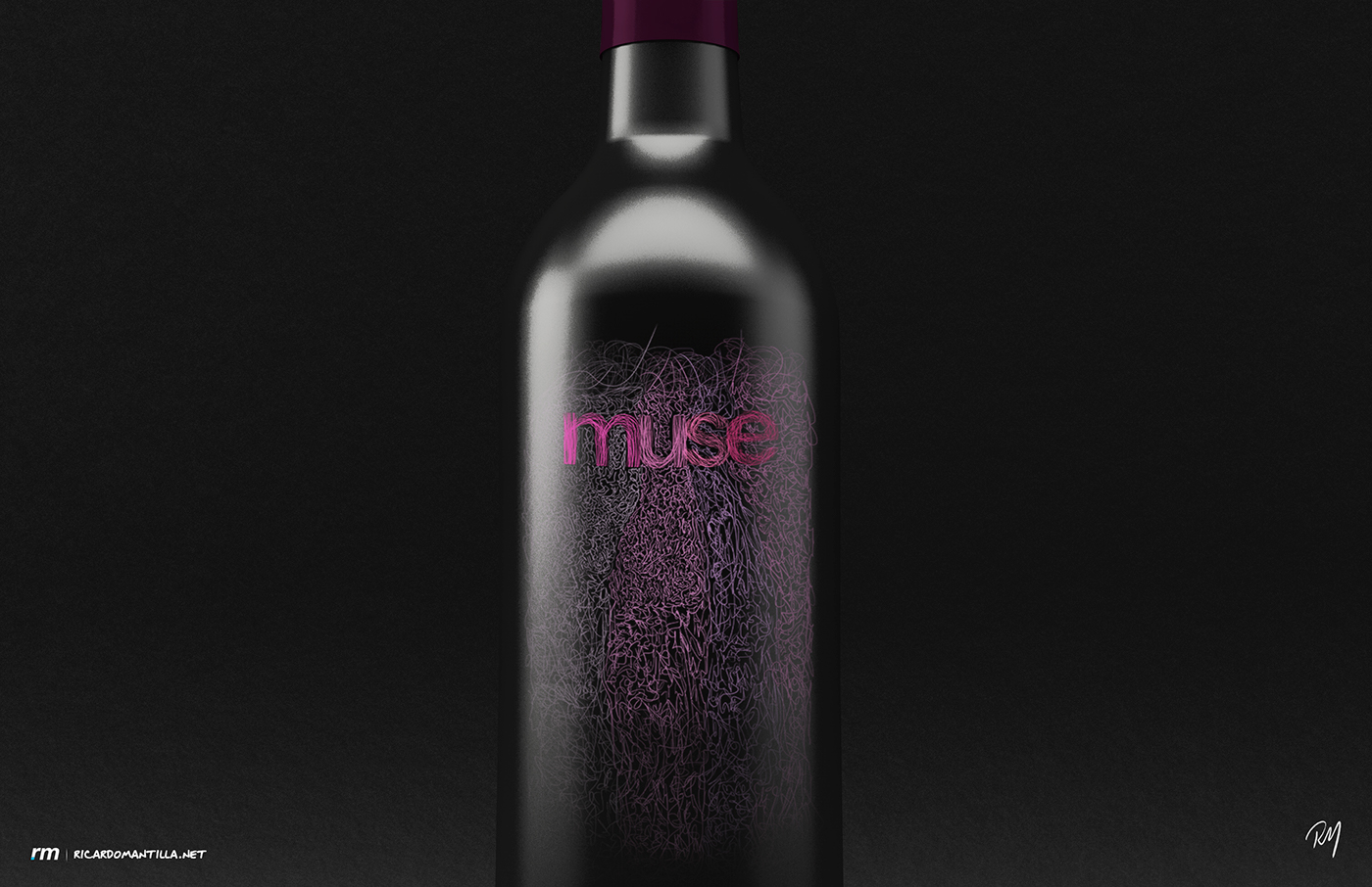
Cabernet Sauvignon
This type of wine is one of the world’s most widely recognized red wine grape varieties. With that being said, I had to treat this bottle with special care. I designed a matte black bottle and decided to create the label around the bottle with colors that will contrast and adapt to this kind of grape. Following Franz Kline’s style of art with think strokes, I decided to create thin strokes from each letter with different colors for each one of those. This lines go down the bottle with a very abstract pattern that gives character to the bottle. The most important thing that I had in mind was to make sure to attach the art style with the type of wine that I creating the design for. This was a hard task, because taking a very classic and recognized wine like the Cabernet Sauvignon needs special treatment when is represented by the abstract expressionism with a specific time period. The color palette was chosen according to the flavor and shape of this kind of wine.

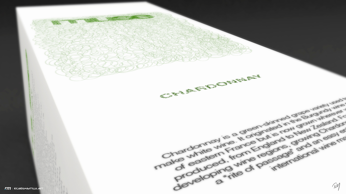
Chardonnay
The green-skinned grape used in this type of wine, was essential when choosing its color palette. When it comes to texture, I created a more organic version of all the other textures. Playing around with curves and circles, I successfully created a proper Chardonnay texture that takes shape of the vines of the grapes following the adapted pattern of Franz Kline. This grape is one of the most important to create white wine in the world, which is why the flavor of this wine is very important in the design. The texture and the colors used in the bottle were picked mixing the colors of existing grapes on wines and champagne bottles. Since this grape was very successful on the west coast of the United States, I decided to give it a little bit of light and bright up the color palette.

Pinot Noir
Following the style of the abstract expressionism, I ended up creating different textures with an analogous color palette. The choices I made to create this palette were made accordingly with the history, flavor and the location of each wine origin. This one was the Pinot Noir, which means the grape of Burgundy, and takes its name from the French words for pine and grapes of darker color. Pinot Noir is also a very important grape in Champagne, and is used as a blending grape. All this aspects were considered on my process of the creation of the textures and the color palette in this design. On the box only on color was used, which is the predominant color. A purple red color was chosen to represent the Pinot noir. The packaging design is very minimal, but it keeps the abstract style on its way. The strokes and the style were adapted from the art of Franz Kline, a very abstract expressionism artist from the 1960s


