


The Concept of the brand identity of the Cybathlon — Cyborg Olympic Games
The Olympic Games are the competition among the most trained and most talented athletes on the planet.
The Paralympic Games are the same, but for disabled athletes. To be able to compete, many Paralympic athletes use assistive devices and prostheses, some of which have already evolved into complicated electromechanical devices. At the same time, the organizers of the competition continue to limit the characteristics of the equipment of athletes.
Therefore, it makes sense to create a new type of competition — Cyborg Olympic Games (Cybathlon), where the using of the most modern technologies is encouraged.

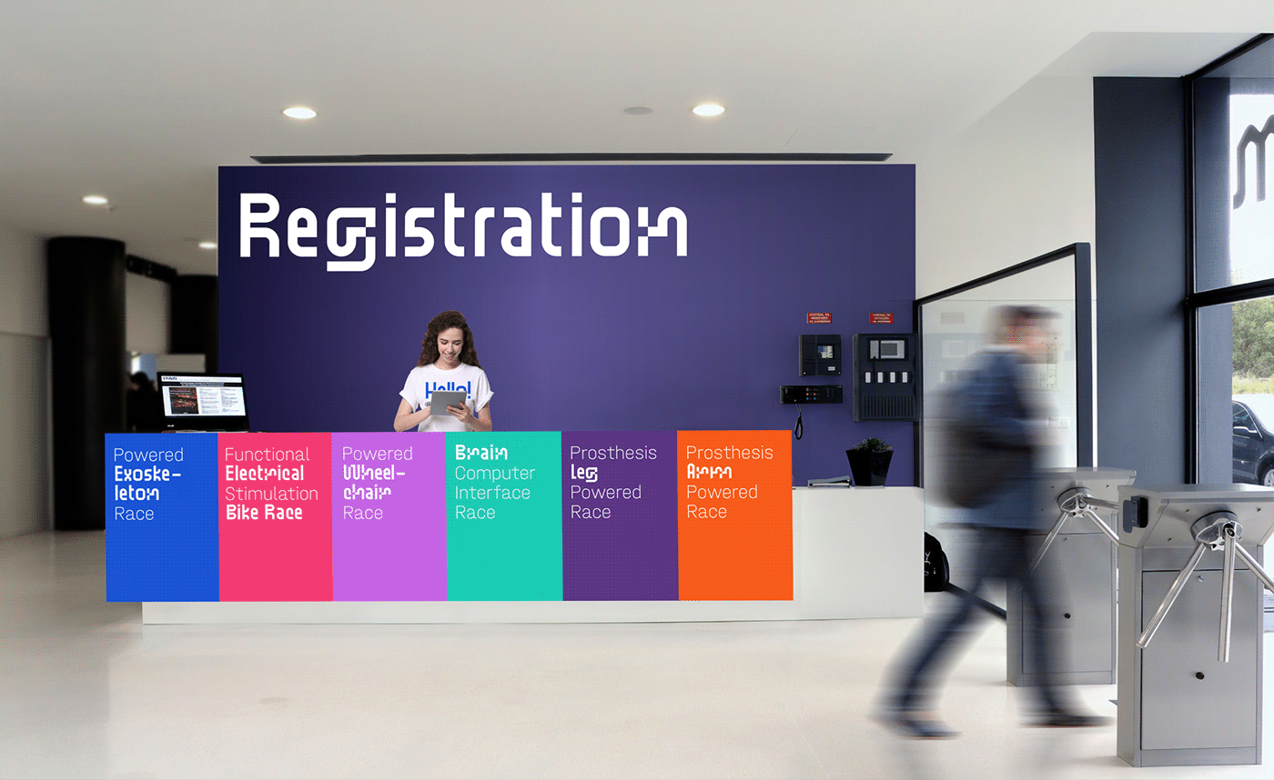
To stand out against the backdrop of the Olympic and Paralympic Games, the Cybathlon needs a new voice: Bold, Determined, Open. The key message of the brand: "Technologies winning for people". The balance of technology and humanity became the starting point in the search for a style for the Cybathlon.
Olympic aesthetics are appealing to the logo. But instead of five continental rings, Cybathlon has six rings according to the number of disciplines in the competition.
Olympic aesthetics are appealing to the logo. But instead of five continental rings, Cybathlon has six rings according to the number of disciplines in the competition.
Fonts:
Standard by BB Bureau
Halvar by Typemates


Major competitions have a lot of target audiences and the brand meets each of them in their own ways.


We are surrounded by different people and we, as designers, have the opportunity to influence their perception through communication. We can make the unusual and uncomfortable — beautiful and aesthetic, we can influence that paralympic athletes will look confident and progressive. I hope that Cybathlon's new style will help it become a part of the global sports agenda.


