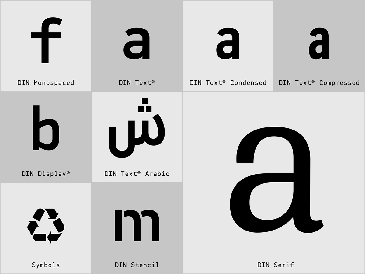
The DIN typeface superfamilies
Copyright ©2002
Designer: Panos Vassiliou
Copyright ©2002
Designer: Panos Vassiliou
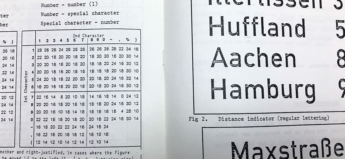
In the 1930’s, the German Standards committee Deutsches Institut Normung (DIN) officially proposed DIN 1451 as the standard type of lettering to be used in the field of road traffic. The purpose of this standard was to lay down a style of lettering which is timeless and easily legible. Unfortunately, these early letters lacked elegance and were not properly designed for typographic applications.
Ever since, several type foundries adopted the original designs for digital photocomposition. The first digital versions were released in 1990 by Adobe but only in four basic variations. Similar ones were also released by URW. By early 2000, it became apparent that the existing DIN-based fonts did not fulfill the ever-increasing demand of complex corporate projects for more weights and support for additional languages.
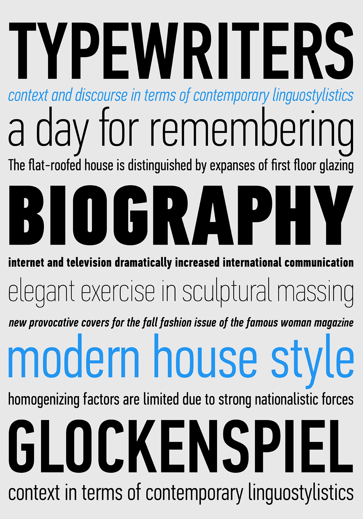
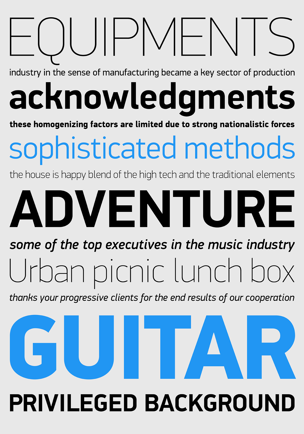
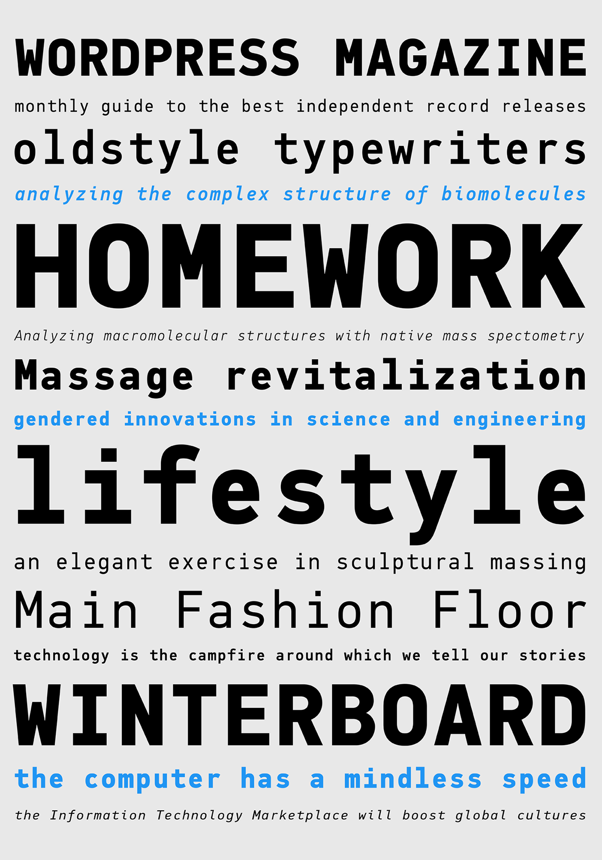
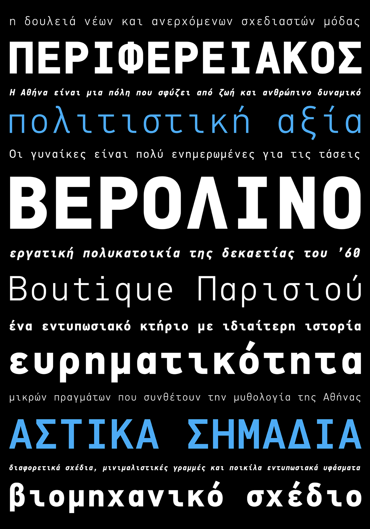
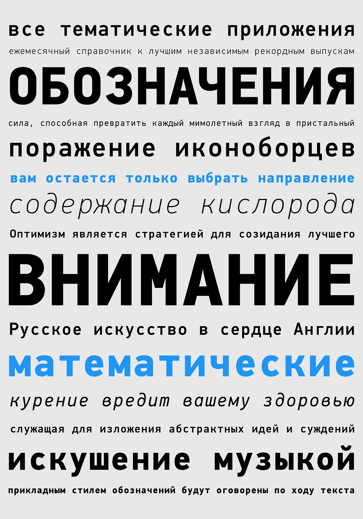
Parachute® was set out to fill this gap by introducing the DIN Text series which has become ever since, the most functional, reliable, convenient and sophisticated DIN type system. After digitising the original printed DIN standards, it was specifically designed to fit typographic requirements. Its letterforms divert from the stiff geometric structure of the original and introduce instead elements which are familiar, softer and easier to read. Completed in 2002, it was published in the 2003 award-winning catalog IDEA as a group of 4 separate families including condensed, compressed and a special display version each with 12 weights and true-italics, for a total of 48 weights and support for Latin and Greek.
DIN Serif Arabic
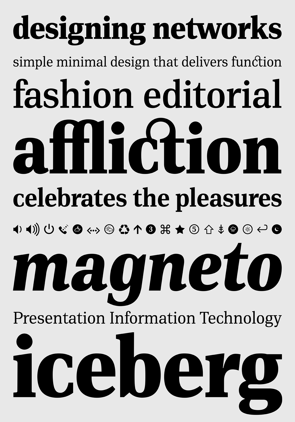
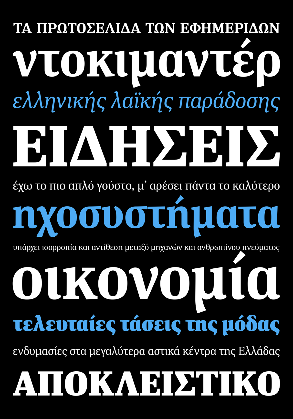
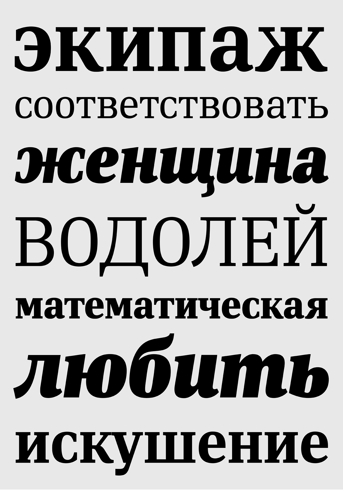
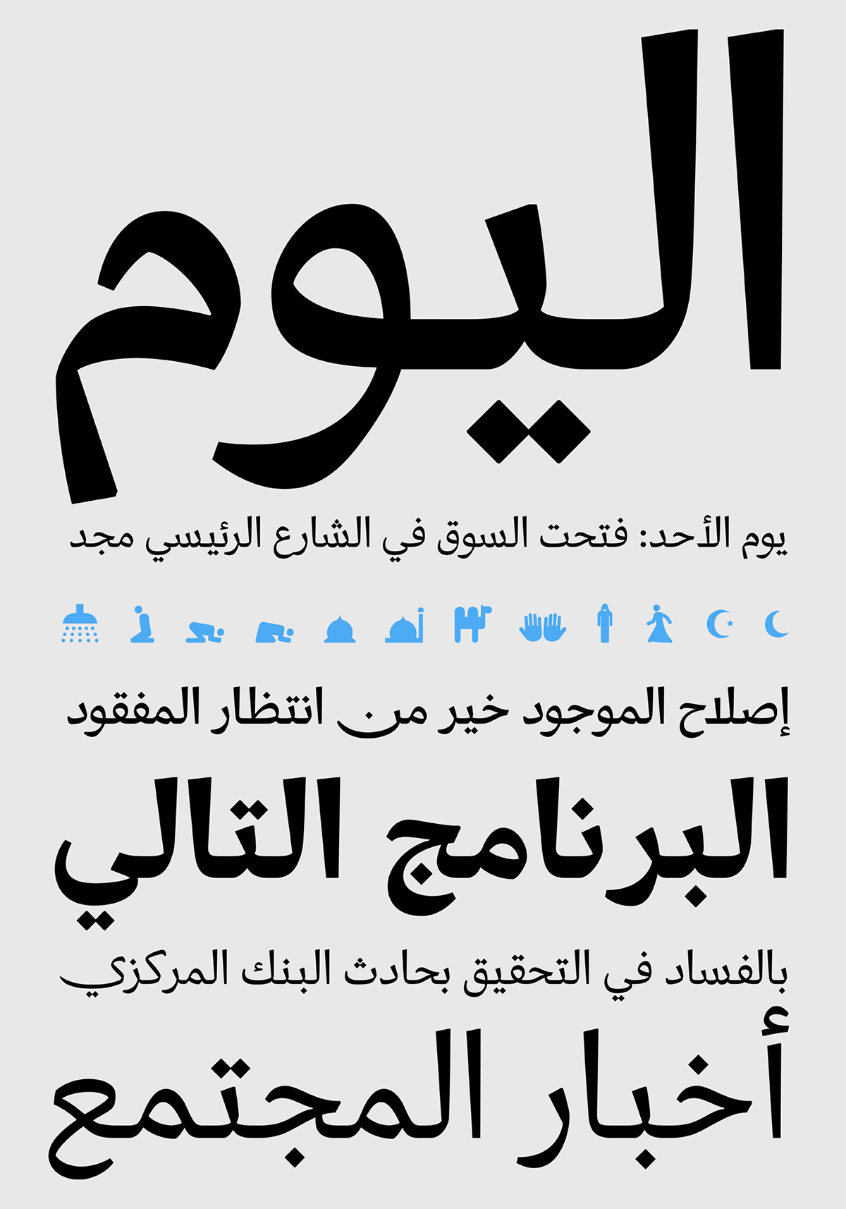
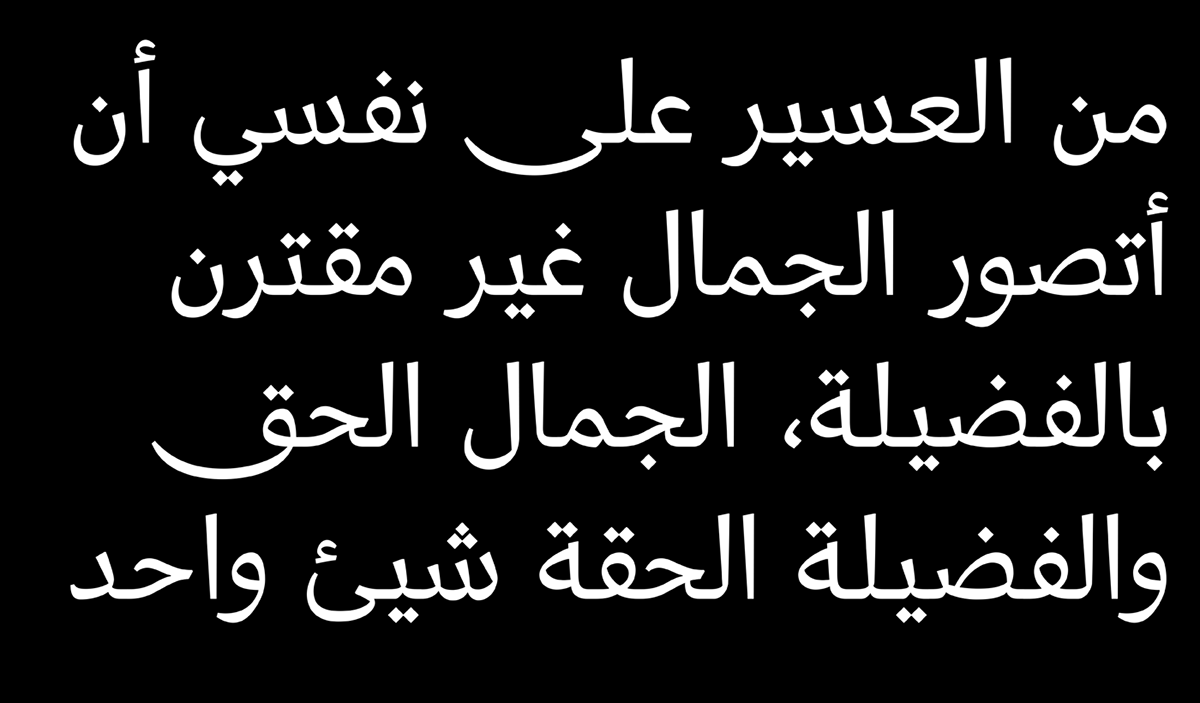
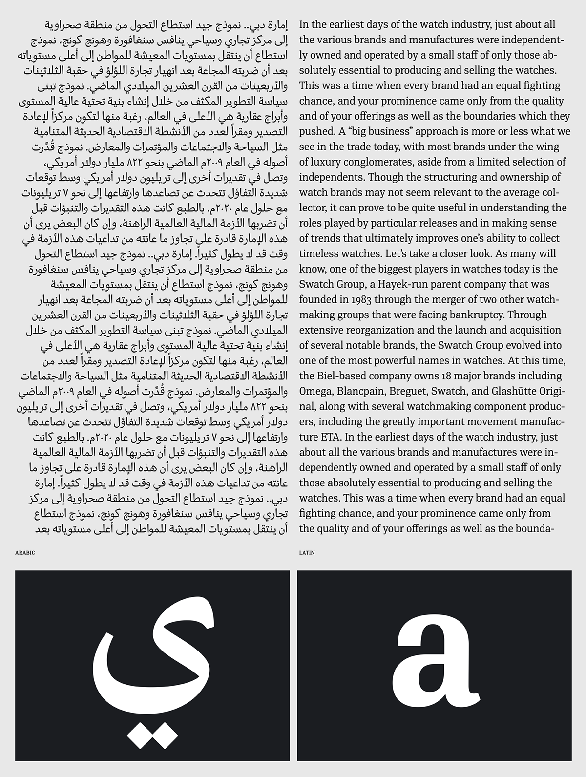
DIN Serif was originally designed as a low contrast typeface with functional and distinct novelties which set it apart from most classic romans. Its solid, simple and subtle serif nature directed the development of its Arabic counterpart away from the traditional calligraphic styles, towards a more simplified contemporary design mixing Naskh characteristics with early Kufi style. Its Arabic letterforms carry through the feel of the original design by using attributes of DIN Serif such as the tension and contrast without copying the curves of the Latin script in its entirety. In fact, several basic characters originated on paper after many tedious trials with a traditional calligraphic bamboo pen. This provided a deeper understanding of its structure and visual rhythm, before converting the letterforms into a digital form and applying additional adjustments.The descenders of DIN Serif Arabic are short to match the proportions of the Latin version. The contrast between the thick and thin is maintained although inverted. Finally, it has carefully designed open counters that match the colour of the original. DIN Serif Arabic is fresh, clean, reliable and quite legible. Therefore, it is highly recommended for newspapers, magazines and other printed matter.
This version takes into consideration the new Unicode standard and supports additional languages such as Persian, Tajik, Kurdish Sorani, Kurdish Kirmanji, Pashtu, Baluchi, Urdu, Punjabi, Azeri, Kazakh, Tatar, Uighu.
Furthermore, each font style includes several Arabic practical symbols as well as swashes. All weights from Regular to Extra Black were meticulously hinted for excellent display performance on the web.
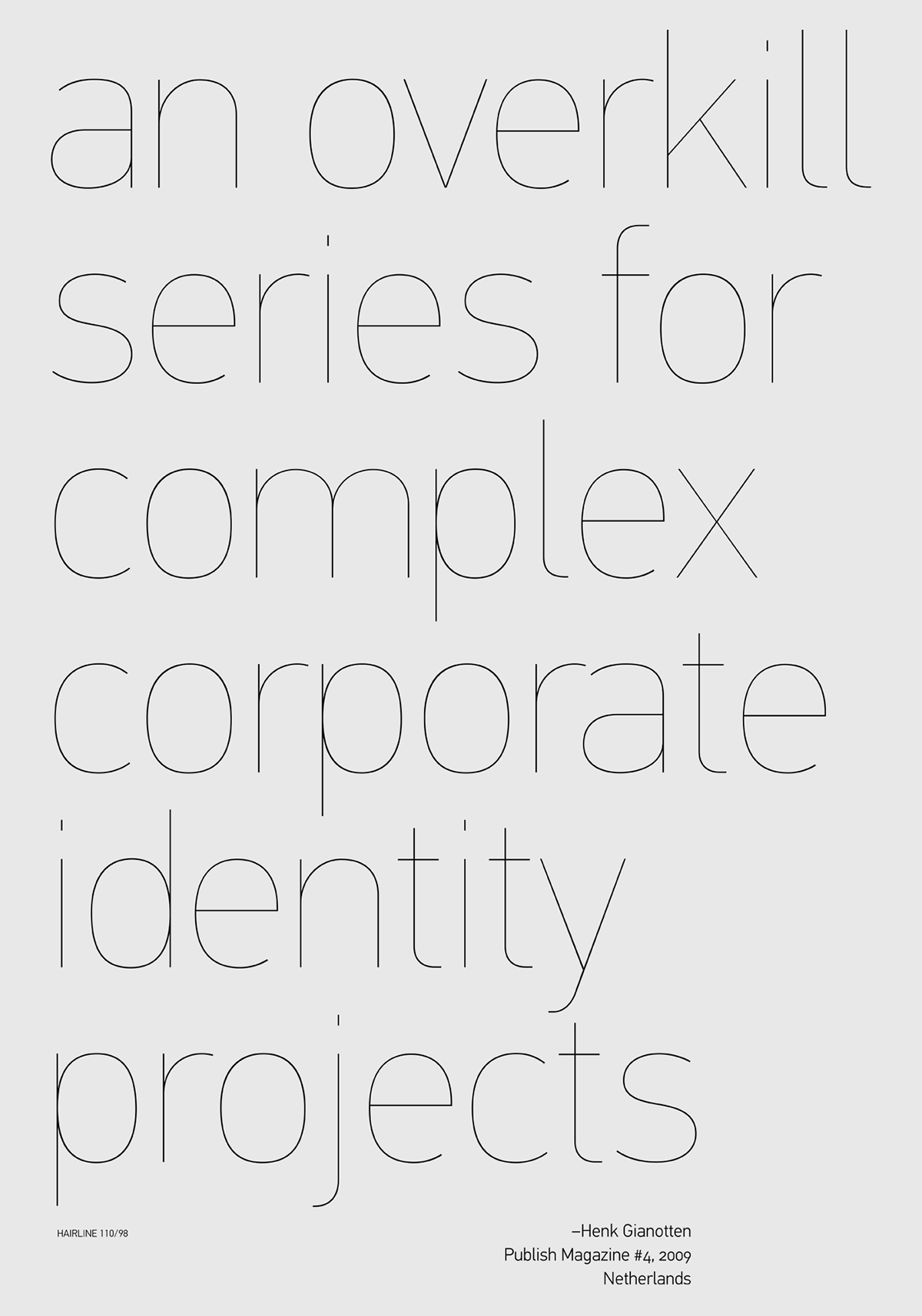
With its vast array of weights, the extended language support, but most of all its meticulous and elaborate design, it has been proved valuable to numerous design agencies. Ever since its first release, it has been used around the world in diverse editorial, packaging, branding and advertising campaigns. It was quoted by Publish magazine as being “an overkill series for complex corporate identity projects”.
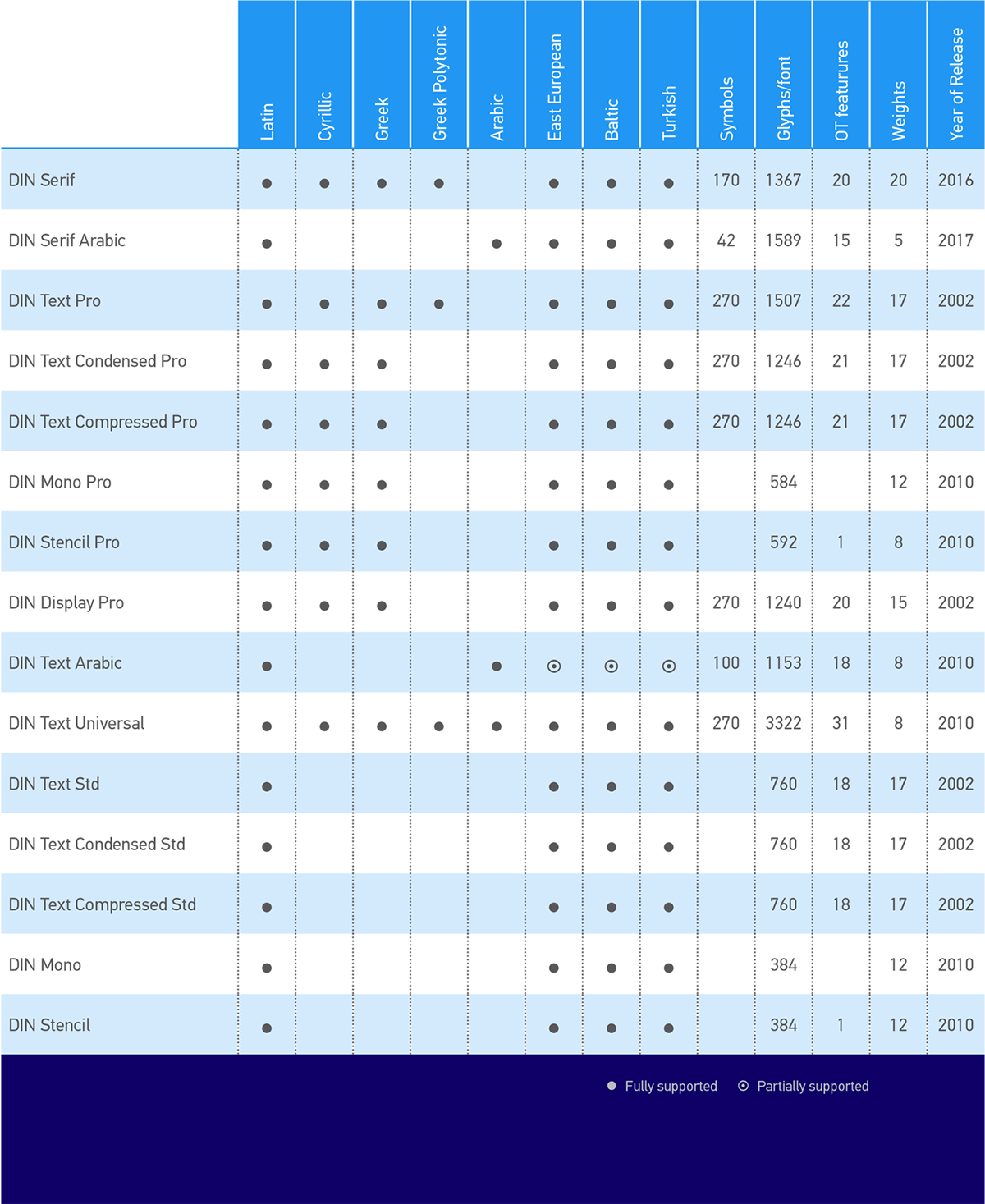
By 2005 all families were upgraded to include 14 weights each, opentype features (small caps, etc) and extended support for all European languages including Cyrillic. Later on, an additional Hairline weight was added to all families. Eventually, these superfamilies ended up with 15 weights and 1465 glyphs per font.
Finally, in 2010 Parachute® released 4 new families:
DIN Monospaced
DIN Stencil
DIN Text Arabic
DIN Text Universal
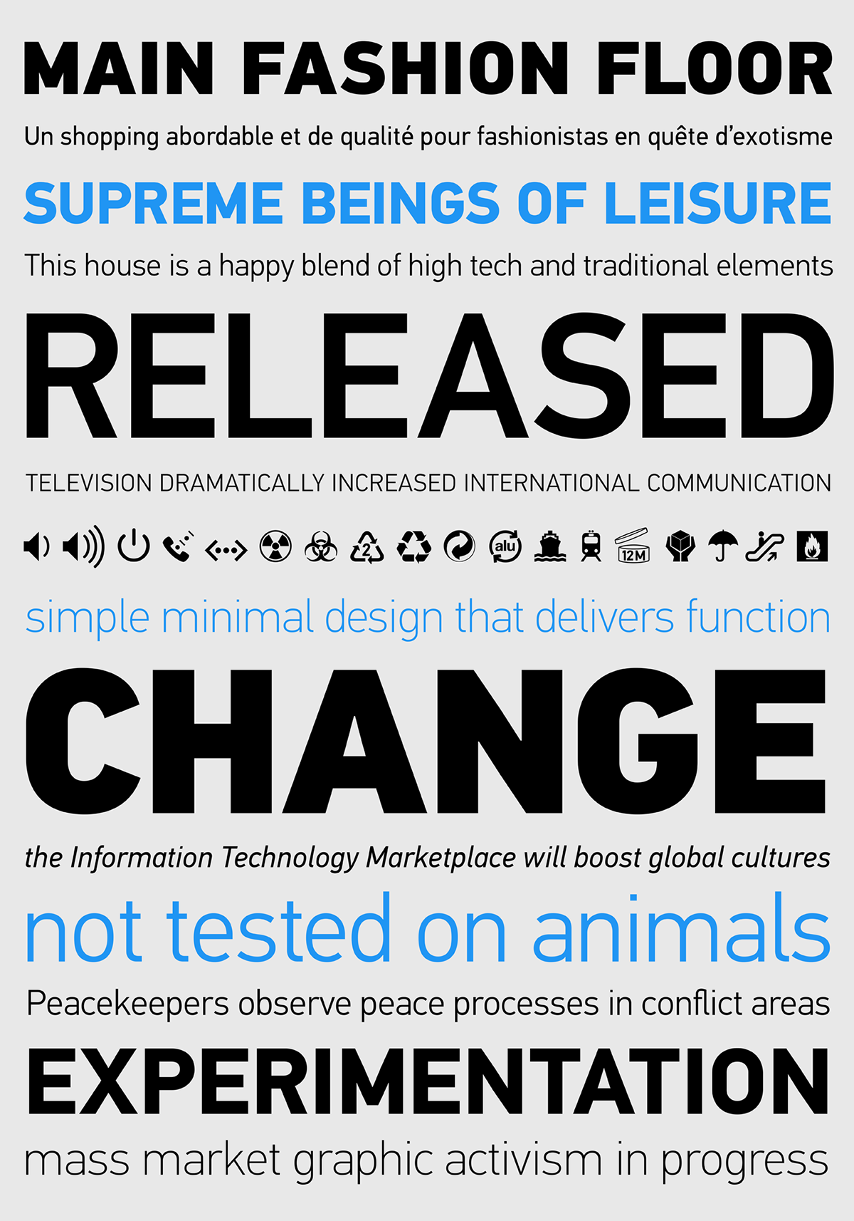
The latest DIN Text version 4.o released in late 2015, has been enhanced with new weights and glyphs such as the German capital sharp s, Russian rouble, Ukrainian Hryvnia, Azeri and Kazakh letterforms. The whole PF DIN type system includes now 102 weights from Hairline to Extra Black including true-italics. Additionally, every font in the Pro series is powered by 270 very useful symbols for packaging, environmental graphics, signage, transportation, computing, fabric care.
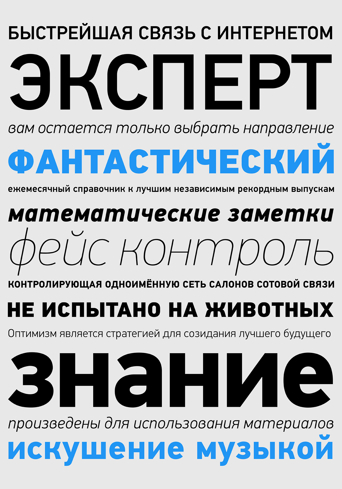
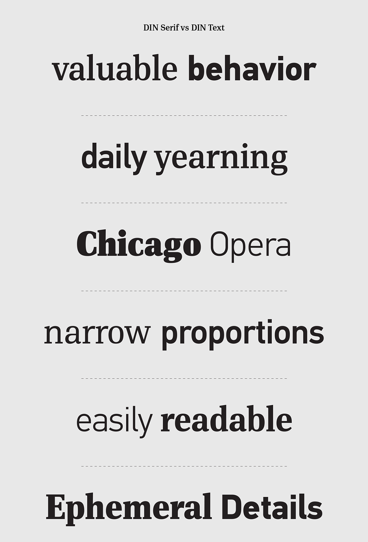
The DIN Text Pro has lowercase ascenders that are higher than the capitals, varying letter proportions and italics that are not mechanically-obliqued versions of the regular weights, but rather true-italics.
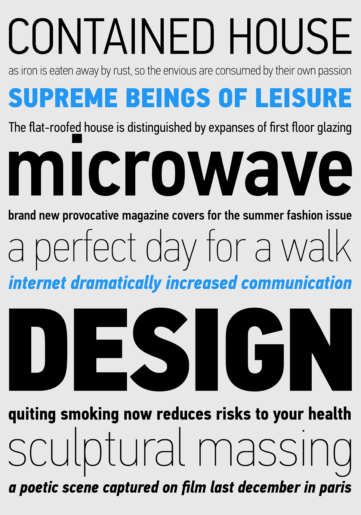
The letterforms divert from the stiff geometric structure of the original and introduce instead elements which are familiar, softer and easier to read. The other two superfamilies Condensed and Compressed share the same attributes as the original.
DIN Display Pro, on the other hand, was designed as an alternative to the DIN Text Pro series. While DIN Display seems to retain DIN’s basic characteristics, it shines with its sharper corners and contemporary look. This superfamily, just like the other three, is enhanced with true-italics.
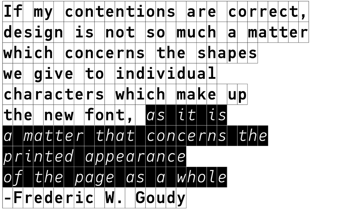
PF DIN Monospaced Pro is one of the latest additions to the ever-growing set of DIN super families by Parachute®. It was based on its proportional counterpart DIN Text Pro, but was completely redesigned to reflect its new identity.
DIN Monospaced is a monospace typeface which is comprised of characters with fixed width. In the world of proportionality, DIN Monospace stands out as a fresh new alternative to the popular standard, particularly for publishing and branding applications.
The Monospace family consists of 12 weights including true-italics.
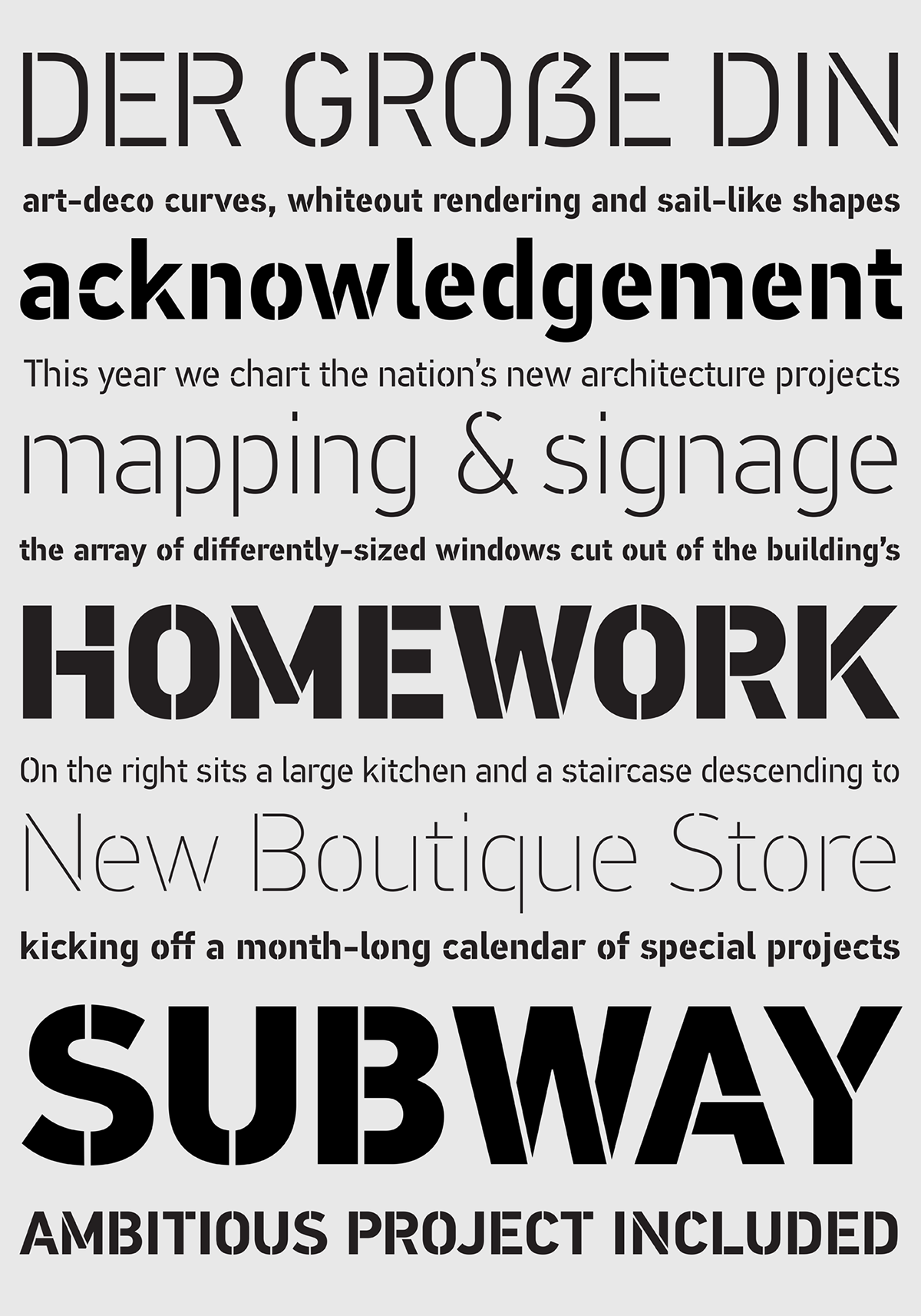
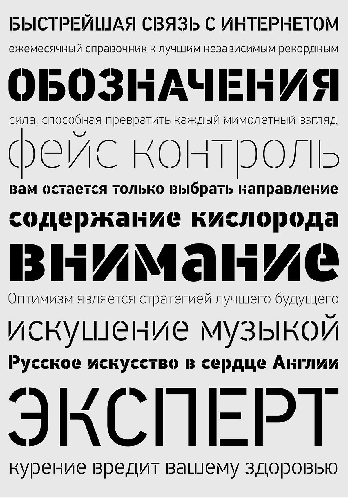
Despite the fact that over the years several designers have manually created stencil lettering for various projects based on DIN, there has never been a professional digital stencil version of any DIN-based typeface.
The DIN Stencil Pro family manages to preserve several traditional stencil features, but introduces additional modernities which enhance its pleasing characteristics and make it an ideal choice for a large number of contemporary projects. Furthermore, the spacing attributes of the glyphs were redefined and legibility was improved by revising the shape of the letterforms.
The DIN Stencil family consists of 8 diverse weights from the elegant Hairline to the muscular Black.


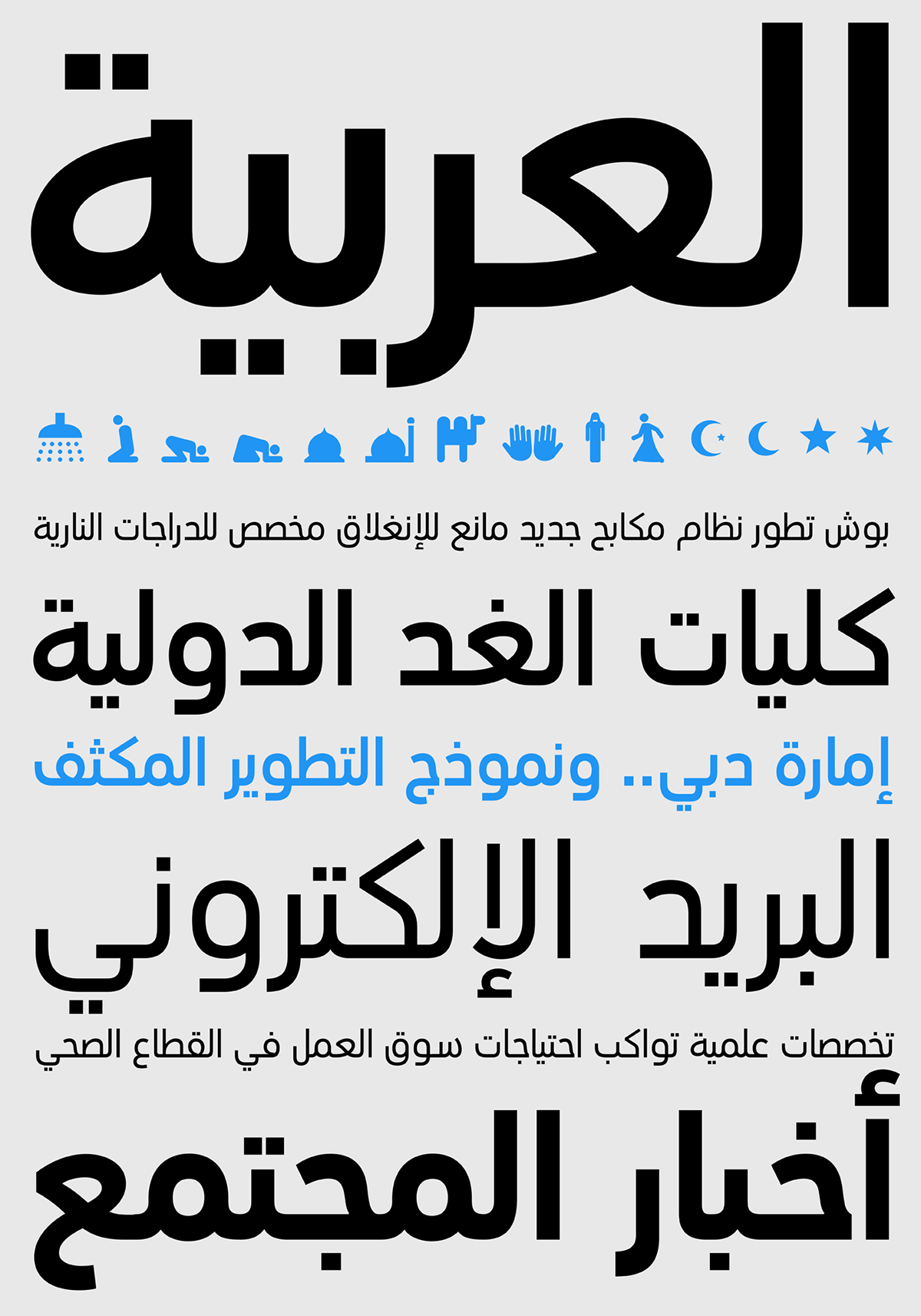
In 2010, Parachute® released -in collaboration with designer Hasan Abu Afash- 2 new versions. DIN Text Arabic is the basic Arabic version which includes Latin and supports all variations of the Arabic script such as Persian, Urdu and Pashto.
This matching Arabic family contains a powerful array of features which was recently (2015) enhanced with a series of 100 practical Arabic and Western symbols for packaging, public areas, environment, transportation, computers, fabric care and urban life. DIN Text® Arabic has participated in several exhibitions worldwide and was featured in Arabesque 2, a book about contemporary Arabic art and design, published by Gestalten.
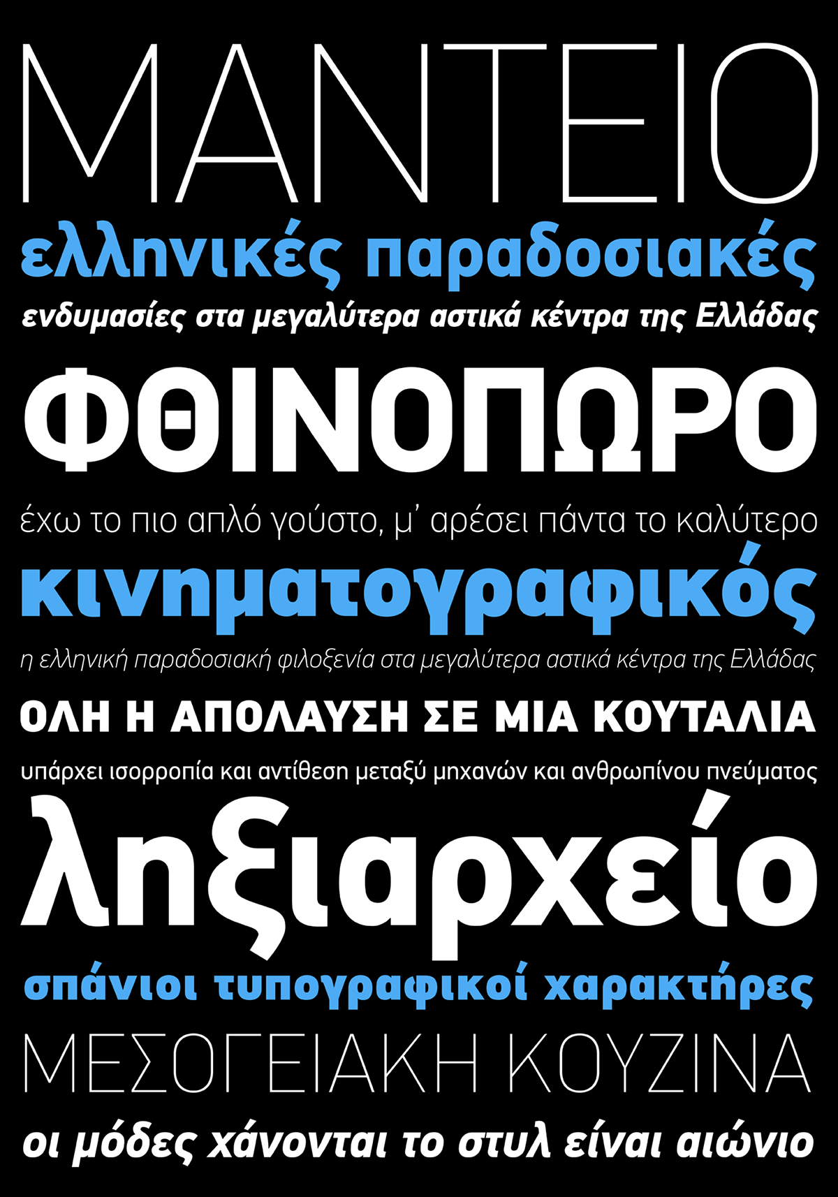
The second version DIN Text Universal is the most advanced DIN superfamily ever.
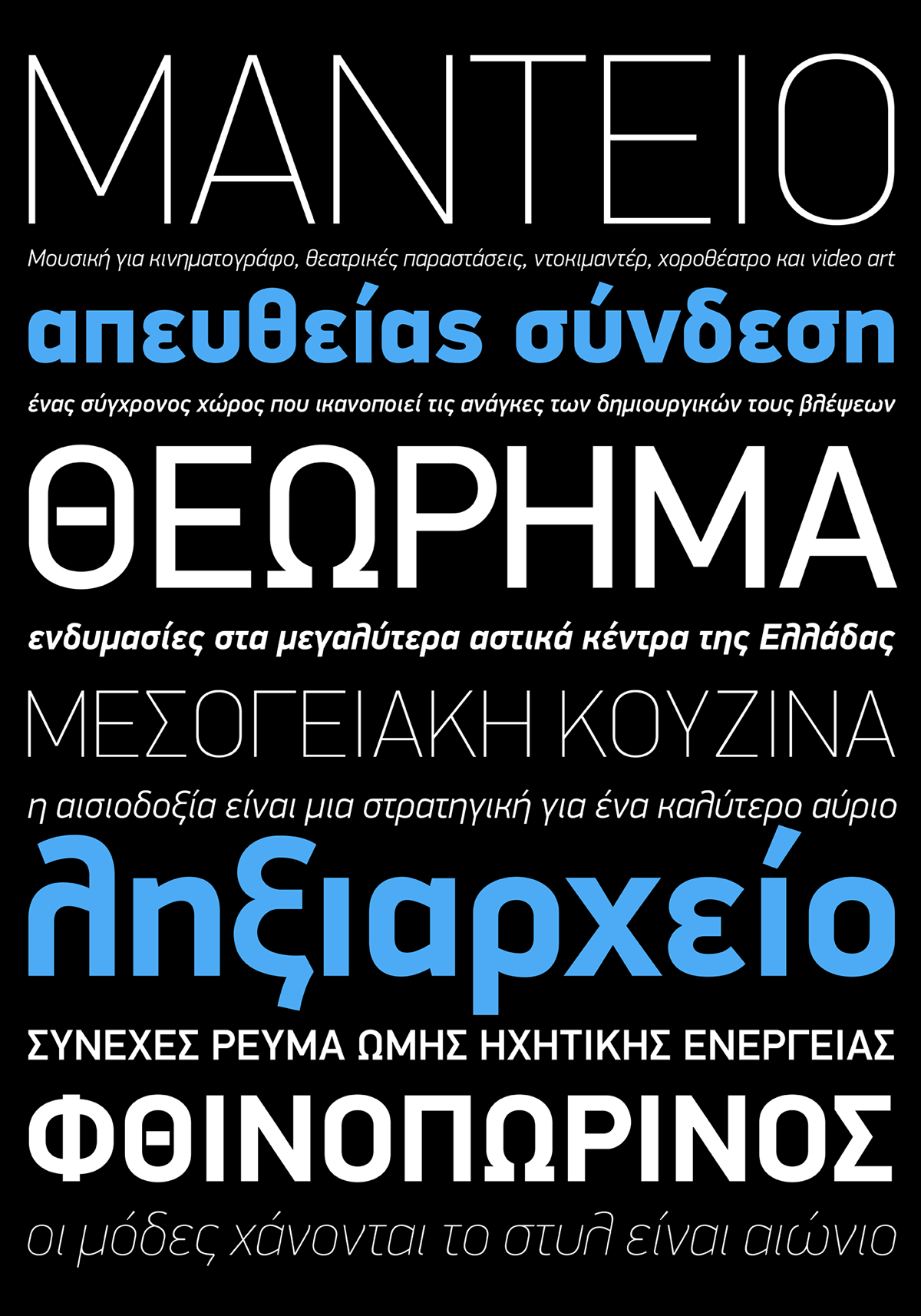
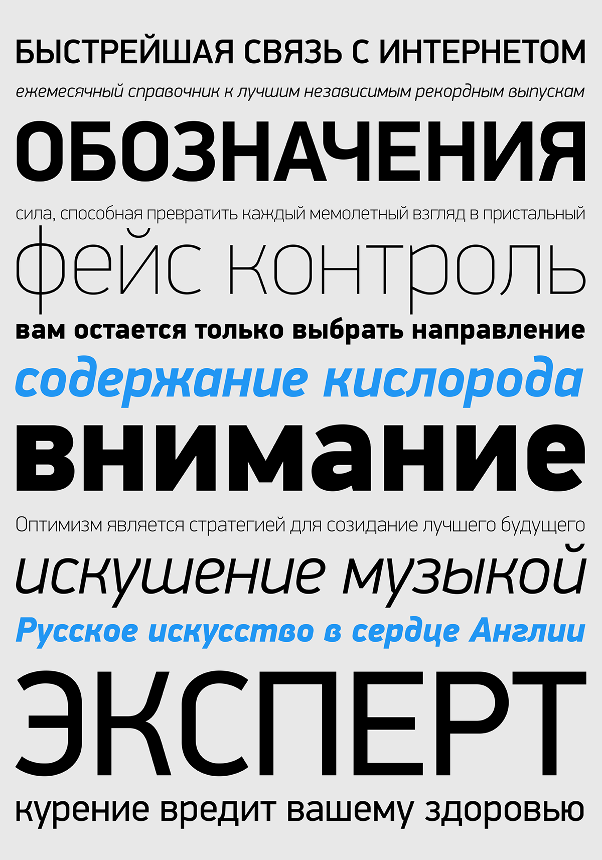
It supports simultaneously Latin, Arabic, Greek and Cyrillic. DIN Text Universal combines the powerful DIN Text Pro with DIN Text Arabic bringing the number of glyphs to a whopping 3320 per font. It supports 30 advanced opentype features and kerning for all languages. Altogether DIN Text Universal supports hundreds of languages, proving to be an essential tool for corporations which are seeking to strengthen the presense of their products in international markets. DIN Text® Arabic has participated in several exhibitions worldwide and was featured in Arabesque 2, a book about contemporary Arabic art and design, published by Gestalten.

View more of the DIN Superfamilies on our website:
DIN Serif
DIN Serif Arabic
DIN Text Pro
DIN Text Condensed Pro
DIN Text Compressed Pro
DIN Display Pro
DIN Monospaced Pro
DIN Stencil Pro
DIN Text Arabic
DIN Text Universal
View more about us:
Website | Facebook | Twitter | Vimeo | Flickr | Pinterest | Instagram
DIN Serif
DIN Serif Arabic
DIN Text Pro
DIN Text Condensed Pro
DIN Text Compressed Pro
DIN Display Pro
DIN Monospaced Pro
DIN Stencil Pro
DIN Text Arabic
DIN Text Universal
View more about us:
Website | Facebook | Twitter | Vimeo | Flickr | Pinterest | Instagram


