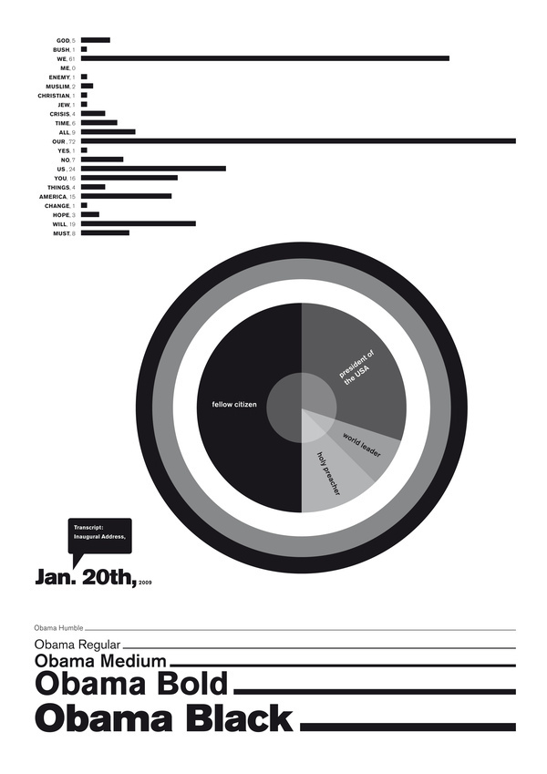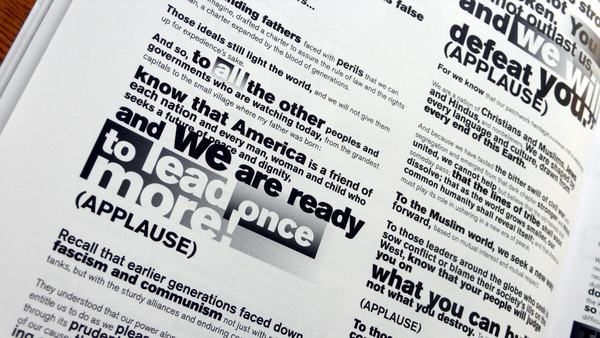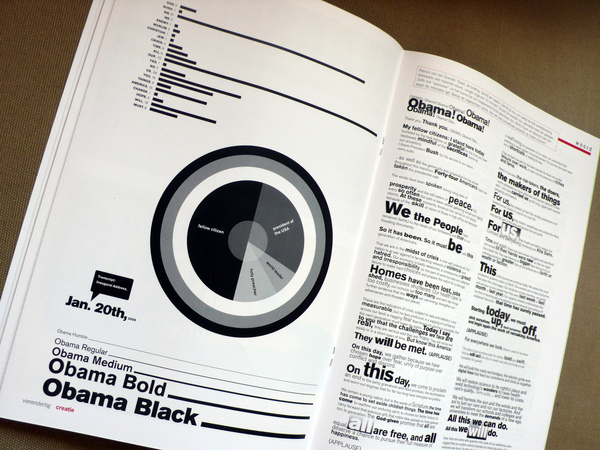
a typographic interpretation of obama's inauguration speech, made for dutch magazine 'creatie'
the onlyrule was no images allowed... i decided to analyse the intonation by watchingit on 'you tube' and breaking it down in terms of recurring words andemphasis...
the onlyrule was no images allowed... i decided to analyse the intonation by watchingit on 'you tube' and breaking it down in terms of recurring words andemphasis...