Photoshop
Illustrator
InDesign CC
InDesign
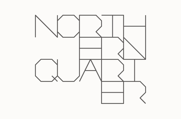
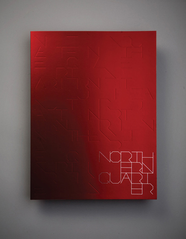
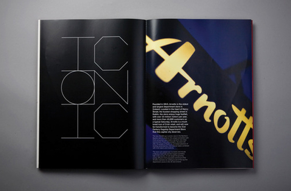
Typography
Art Direction
Type Design
Attribution, Non-commercial, No Derivatives