Hannover, born in 1998, is a spanish men fashion boutique where exclusive garments & accessories brands are to be found. It is worth mentioning that our clients get excellent customer attention. In a nutshell, Hannover is an exquisite shop targeting a very exigent and exclusive public

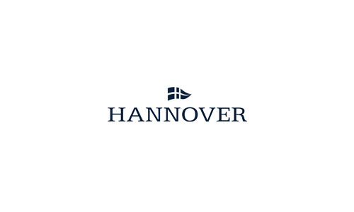
Old logo #1
Old logo #2

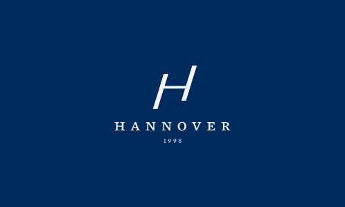
New Hannover identity is elegant, stylish, not old fashioned, but prevailing and chic. It preserves more than ten years of expirience tradition (with text part) but looks forward by modern, dynamic sign, that confidently doing the next step (looks like H strides up)
New sign was made taking account into consideration the lack of ages of history like the most of brands exhibited in the Hannover shop. It is the modern brand having respect for traditions

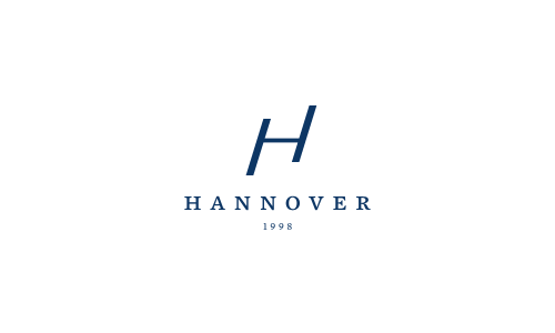
All elements and distances between them are proportional with each other and made with rules of golden ratio

New Hannover text part looks similar to old but a little bit modern and much more accurate and easy to read. Kerning is very imortant!

New blue color (left) is still blue, but more fresh and noble than old

New logo is easy to print on various objects and can be used in monochrome

Mood picture. Identity application example. Picture was taken from official Hackett London's photostream just for example

Mood picture. Identity application example. Picture was taken from official Hackett London's photostream just for example
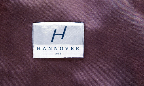

Tissue paper


Thank you,
Andrey Grabelnikovhttp://www.grabelnikov.com
Andrey Grabelnikovhttp://www.grabelnikov.com

