It’s been a while since I stopped thinking about preserving my own style or going along the same line in works which I include in my portfolio. It happens on its own.
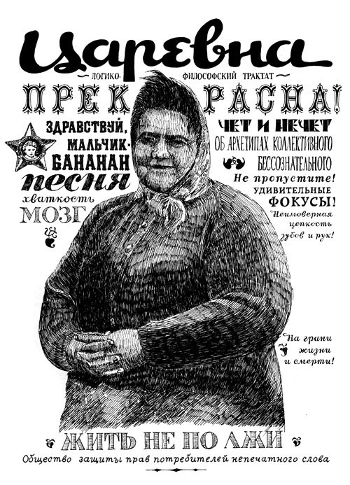
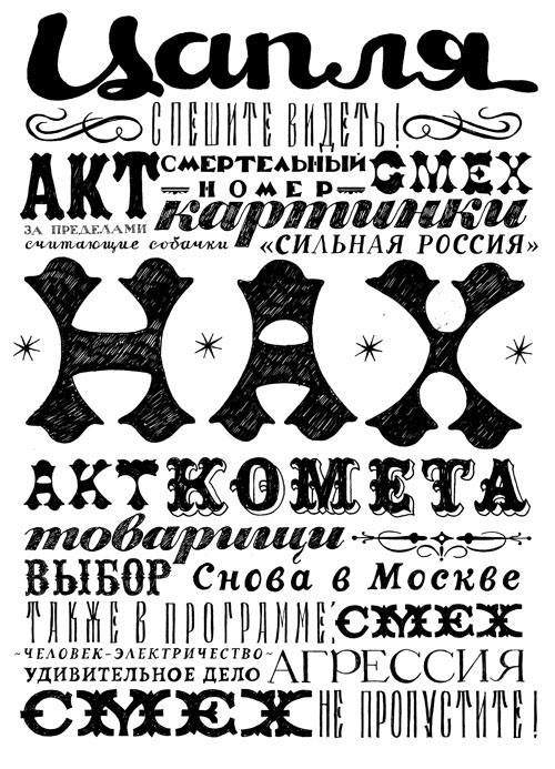
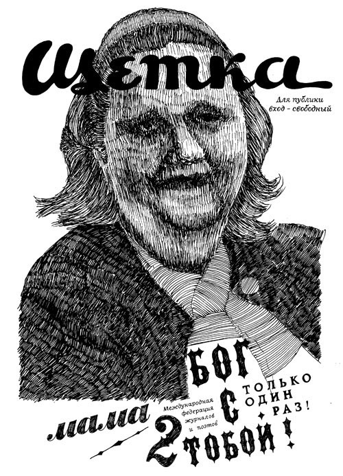
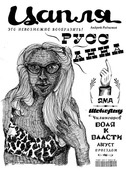
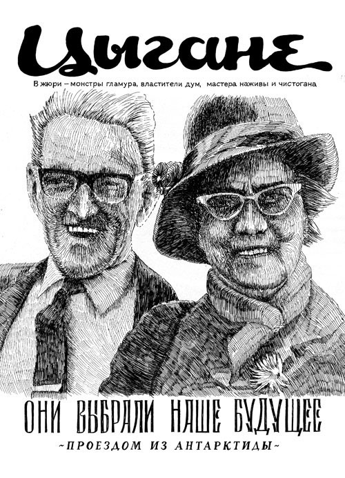
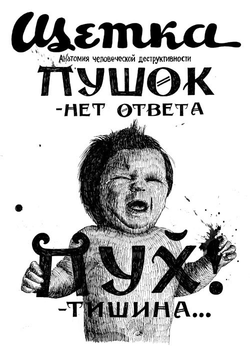
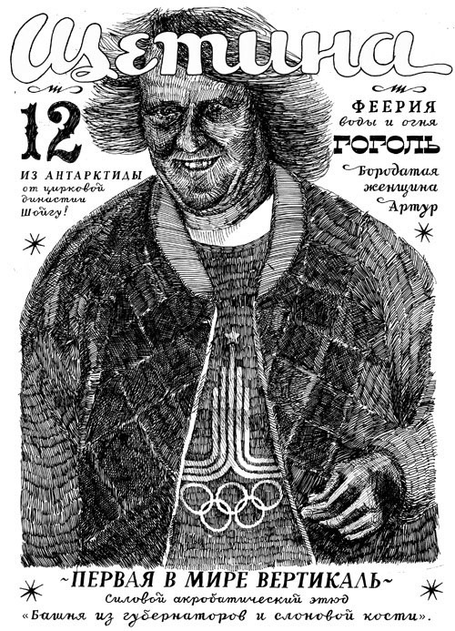
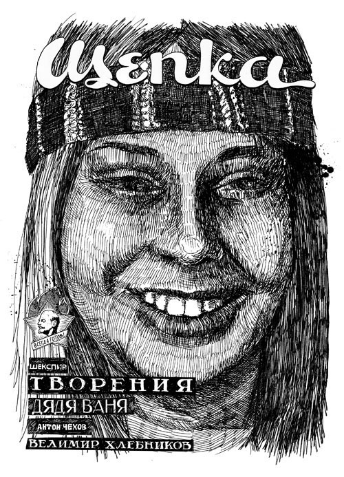
It is much more important for me today to show my Russian roots through my works. Even if it’s a small illustration for a small magazine or something I do for a world-famous brand, I try to include a Cyrillic writing, or a Russian Lada car, or even a Kamaz truck. It’s like a personal signature thing.
It is much more important for me today to show my Russian roots through my works. Even if it’s a small illustration for a small magazine or something I do for a world-famous brand, I try to include a Cyrillic writing, or a Russian Lada car, or even a Kamaz truck. It’s like a personal signature thing.
Personally, I am not against digital methods, but I simply don’t use them, just as I don’t use vector graphics. It’s all very personal. Everyone chooses their own way in this. In my case, I always preferred the hand-made method.
I felt a certain magic about typefaces even before I got acquainted with computers. My parents have had loads of coffee-table books with Soviet art of the 1920-s. Back then avant-garde artists used lots of typefaces in their paintings. Still life paintings in oil on canvas with huge black letters on the background mesmerized me. I thought they were something out of this world.
I felt a certain magic about typefaces even before I got acquainted with computers. My parents have had loads of coffee-table books with Soviet art of the 1920-s. Back then avant-garde artists used lots of typefaces in their paintings. Still life paintings in oil on canvas with huge black letters on the background mesmerized me. I thought they were something out of this world.