Log In
Discover
Assets
Jobs
Behance
Pro
Hire Freelancers
Download on the App Store
Get it on Google Play
English
Čeština
Dansk
Deutsch
Español
Français
Italiano
Nederlands
Norsk
Polski
Português
Pусский
Suomi
Svenska
Türkçe
日本語
한국어
中文(简体)
中文(繁體)
About
Blog
TOU
Privacy
Community
Help
Do not sell or share my personal information
Sign Up
Skip to Main Content
Skip to Footer
Behance
Behance
Navigate to behance.net
Explore
Assets
Jobs
Behance
Pro
Hire Freelancers
search
magnifying glass
Sort & filter all:
Projects
Images
People
Assets
People to Hire
Cancel
search
magnifying glass
View your notifications within Behance.
View your notifications within Behance.
Log In
Sign Up
search
magnifying glass
Adobe, Inc.
Adobe, Inc.
Navigate to adobe.com
+2
Follow All
Unfollow All
Follow
Following
Add to Moodboard
Save
Share & Embed This Project
Share
Appreciate
Appreciate
Follow All
Following All
Unfollow All
Follow All
Unfollow All
+2
City of Melbourne
Multiple Owners
•
Follow All
Following All
Unfollow All
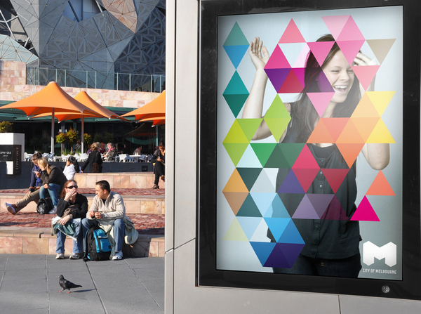
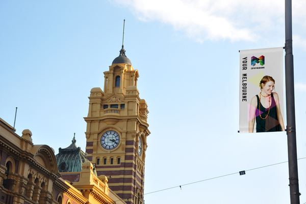
Featured In
Behance.net
—
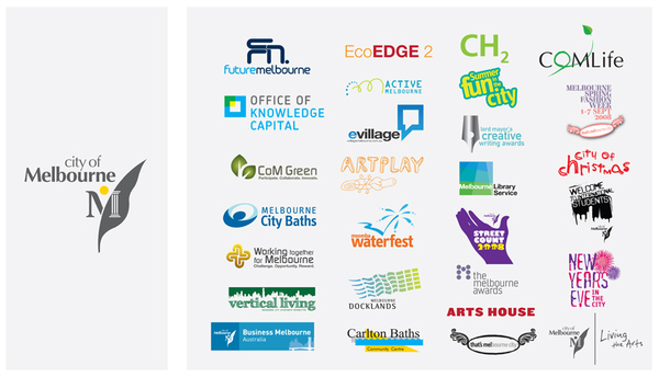
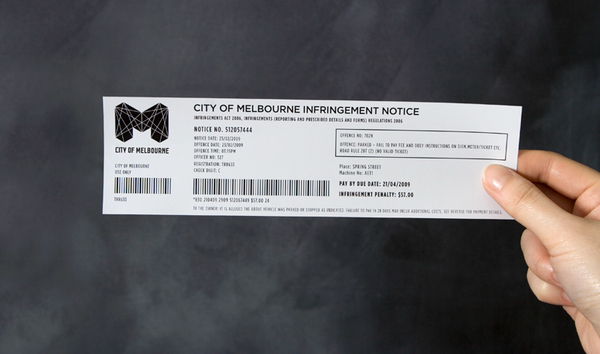
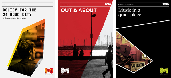
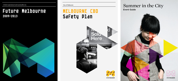
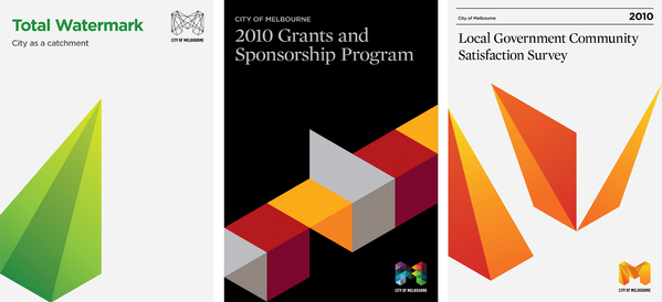
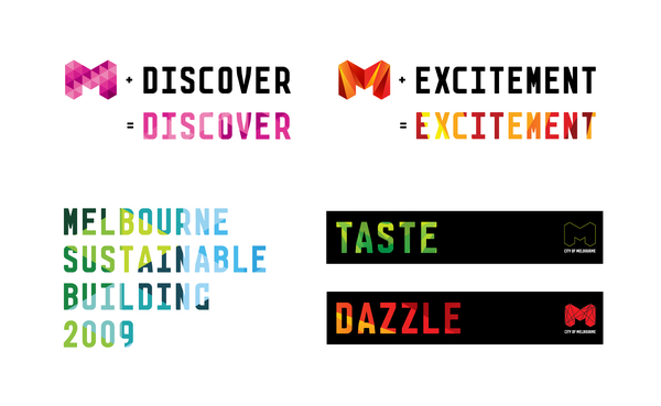
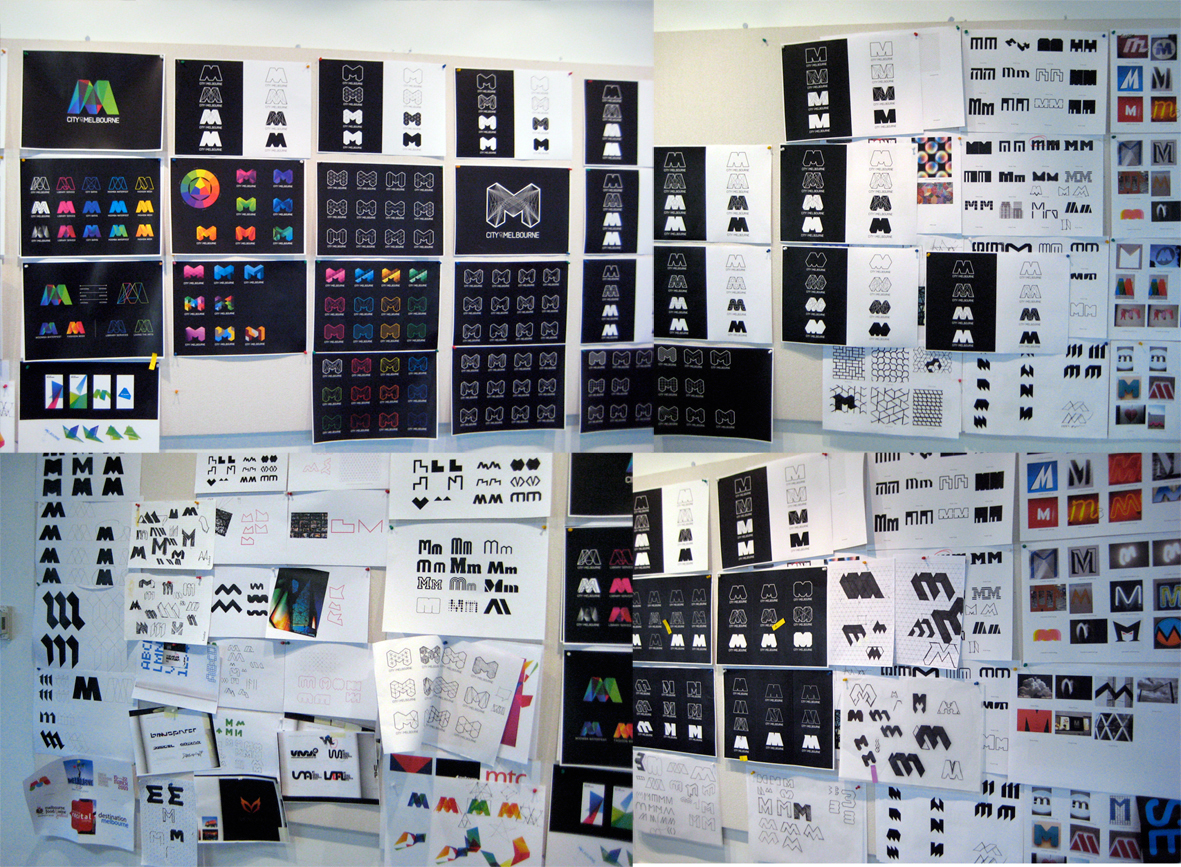
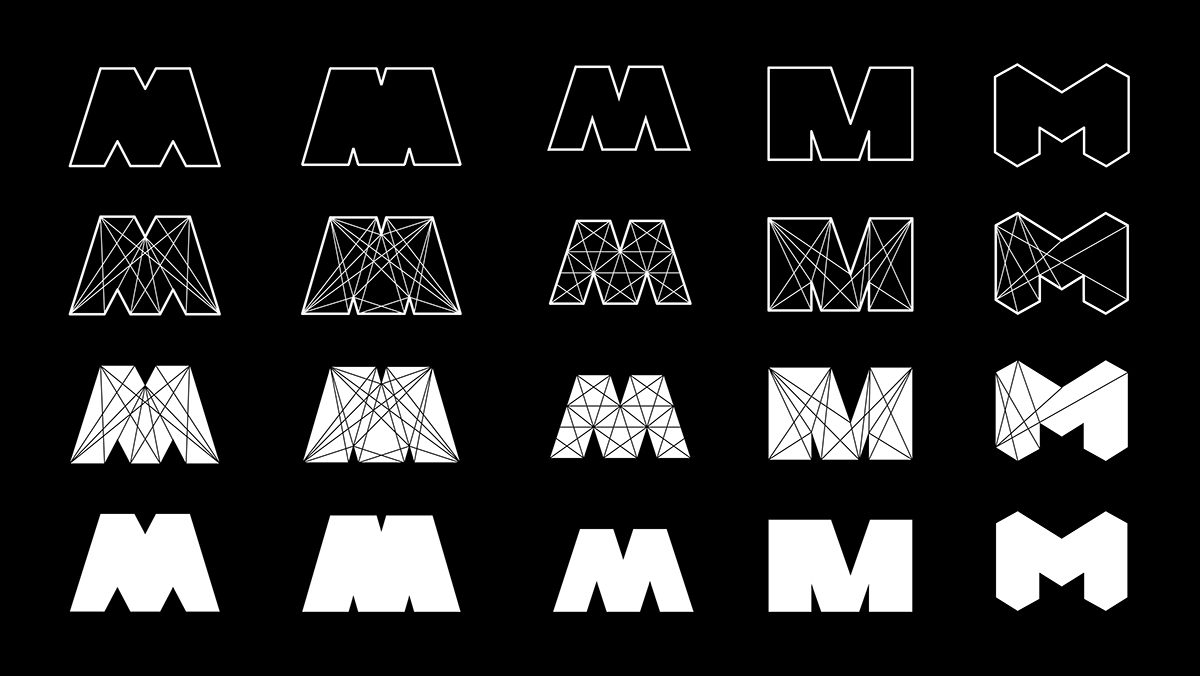
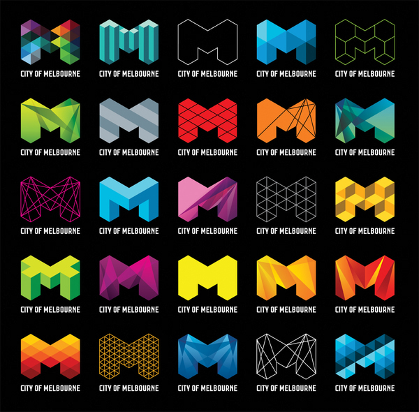
Previous Identity
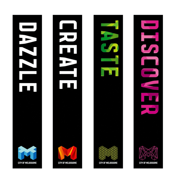
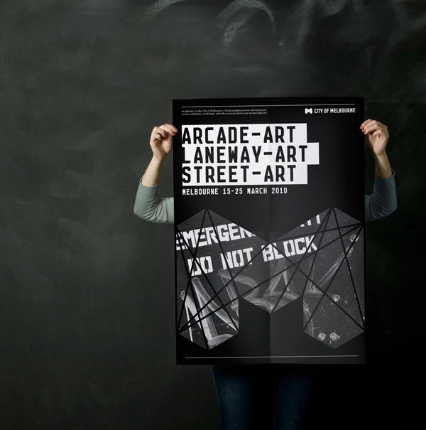
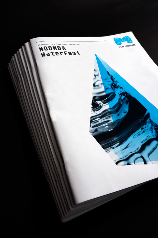
Previous Identity & Sub brands / initiatives
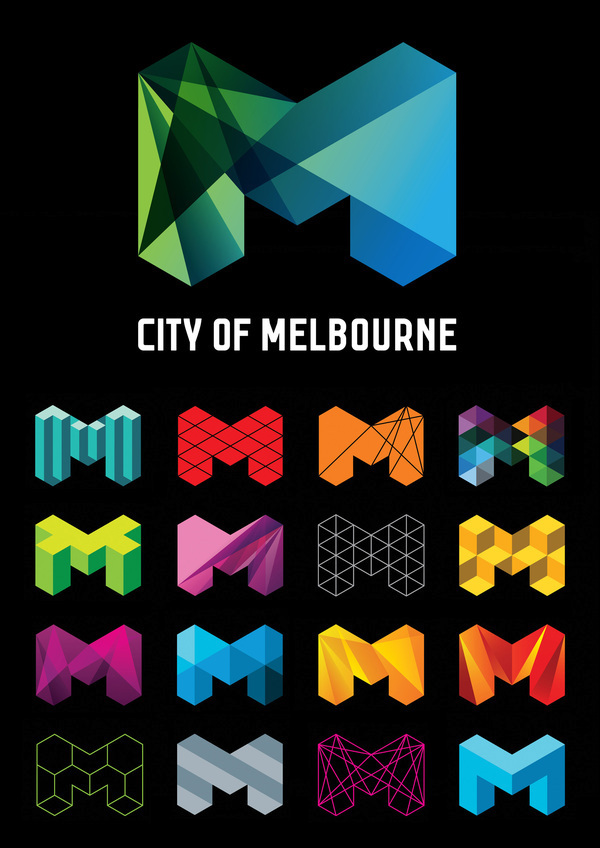
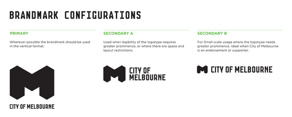
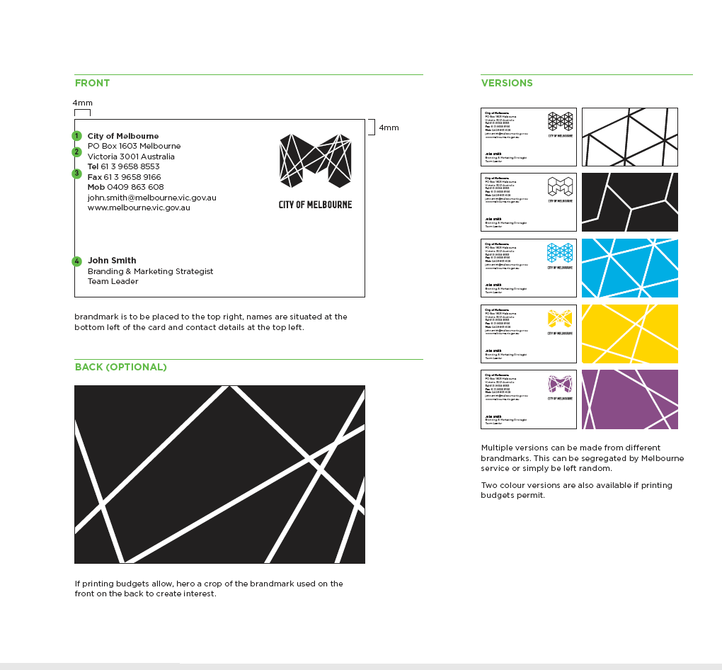
Identity system
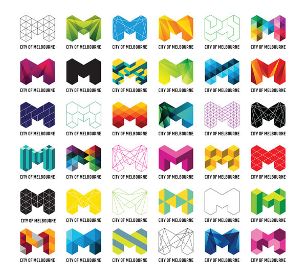
Identity construction
Join Behance
Sign up
or
Sign in
to view personalized recommendations, follow creatives, and more.
Sign Up With Email
Sign Up
or
Join Behance
Sign up
or
Sign in
to view personalized recommendations, follow creatives, and more.
Sign Up With Email
Sign Up
or
City of Melbourne
33.2k
570.1k
1.3k
Published:
September 1st 2009
+2
Multiple Owners
Follow All
Following All
Unfollow All
Owners
Jason Little
Sydney, Australia
Follow
Following
Unfollow
Ivana Martinovic
Sydney, Australia
Follow
Following
Unfollow
Jefton Sungkar
Sydney, Australia
Follow
Following
Unfollow
Jefton Sungkar
Sydney, Australia
Follow
Following
Unfollow
City of Melbourne
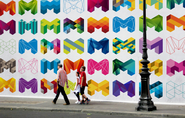
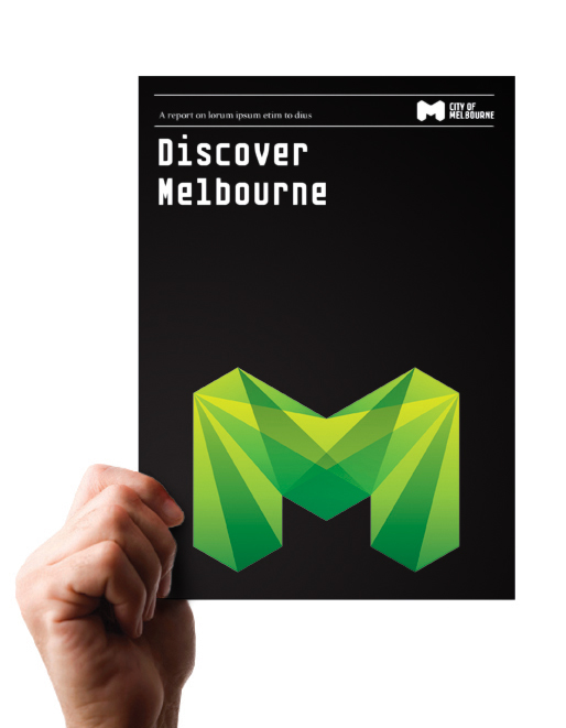
City of Melbourne is a dynamic, progressive city, internationally recognized for its diversity, innovation, sustainability, and livability. City
Read More
33.2k
570.1k
1.3k
Published:
September 1st 2009
Creative Fields
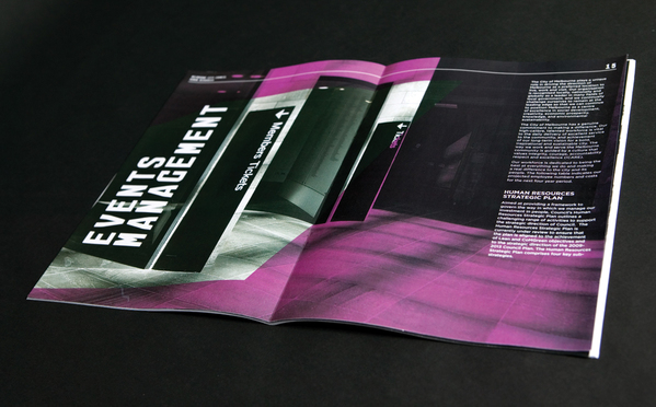
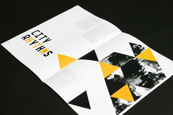
Branding
Typography
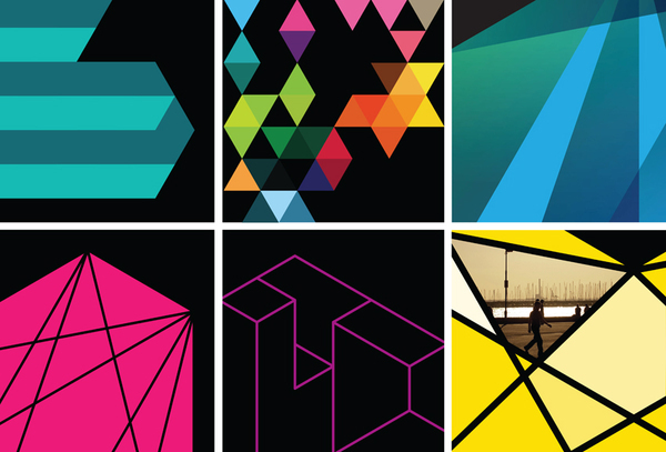
city
facets
colour
Melbourne
Australia
Dynamic
container
crystal
geometric
triangle
International
tourism
Government
sydney
Copyright Info
Attribution, No Derivatives
Read More
Report